The Right Polish for Spring Skin

Where agreement, order, and a sense of belonging exist between the elements of a composition, for example, apparel and hair colour, we sense harmony. 

Harmonious relationships give the colours the ability to interact. This is visual magic, as if the colours in an outfit are speaking to one another. Colours appear more interesting and intense because other colours are there, for example, eyes and lipstick. Each colour gives the others context, a reason for being there, the ability to participate in a story. 

A Spring woman wearing her own colours expresses intelligence, competence, authority, and friendliness at the same time, a talent in which Springs are naturally gifted. Her cheerfulness in no way detracts from her credibility.  She was voted Most Loved Principal by her students. Her workshops are so well-attended because people look forward to being around her. They feel that she just plain likes them. Spring is the no-strings-attached person. 

Colour is reflected light. The best polish for cosmetic effects is a natural extension of how the skin colours and texture naturally reflect light. The makeup becomes part of the skin, rather than being somehow separate.  The skin of each of the 12 Seasonal groups  has a way of reflecting light that is particular to its colours and this will hold true for cosmetics, hair colour, apparel, and jewelry. This post is about how to continue the natural polish of Spring skin. Examples of colours may be found in the Shop on the 12 BLUEPRINTS website.

The Spring Seasons

Spring shares with Autumn  a high degree of warmth in colour. Even colours we think of as cool, such as blue, green, and violet, are adjusted within the palette to harmonize with a warm colour composition.

Spring colours are bright and clear.  Daffodils are a good example of the clear yellow tones that warm Spring palettes. 

Autumn colours are soft, also called muted, and darker. Warmth enters the picture through richer, darker gold. 

Colour and texture are related. Spring-coloured surfaces are often smooth and  appear flatter, as in 2-dimensional. With smoothness comes some degree of shine, paving the way for cream cosmetics, transparency,  glowy highlights, and glossy lips.

Autumn-coloured surfaces reflect light with more depth, giving a 3-dimensional impression. This effect might be extended in cosmetics  in the sculpting of the facial bones with contour, use of powders to convey dry surfaces,  metallics for a drier, harder shine, or matte formulations to convey  opacity, like pouring thick spiced chocolate cocoa.

Spring people have a way of making plastic look expensive. Autumns tend to make plastic look like plastic. In the modern world, the variety of textile, cosmetic, and pigment is tremendous so these categories are far from exclusive. Many beautiful Spring colours may be found in woven linen and faux fur, while Autumn women can look entirely gorgeous in cognac satin.

Also, though Spring and Autumn people do not respond to colour equally in testing situations, the shared quality of warmth and moderate brightness (though Spring is brighter) allows for some crossover in clothing colours. Various colours might be worn well by both groups, such as coral and red-orange at the light to medium, bright end of True Autumn’s range or turquoise on the darker side of True Spring. Metals in jewelry have some flexibility, where shiny gold might be easy for both,  and gemstones may be found in colours that could slide into either palette.

Makeup is different from apparel in that we want it to look like part of the skin, not lying on or above it, Blush and lip colours simulate the colours of blood. Eye makeup is applied to the focal point of our entire appearance and should be in excellent harmony with lip and blush colours to be most beautiful. Therefore, cosmetic colours are best worn  within their own colour family, Spring with Spring and Autumn with Autumn.

Enhancing Spring Skin 

Spring makeup tips: 

1. Divide full coverage foundation with moisturizer. Skin looks the same or better, whereas opaque coverage may appear dry or mask-like.

2. When choosing foundation colour, try the product directly on the jawline in natural light. Compare several and choose the one that’s hardest to see. Spring and Autumn foundations may both be labeled Warm but the colours are not the same. Spring products tend to be lighter beige and perhaps a little yellow-green compared to Autumn’s often darker tones that contain more tan or red. Be cautious with peachy foundation. While we may expect a healthy glow or find the colour attractive, skin is generally more neutral, with a better balance between red and green. If the green tones of skin are acknowledged by the foundation, the red family of pigments in blush becomes more beautiful and effective by the power of complementary colour. Simply said, the right green and red look better together.

3. Keep use of translucent face powder to a minimum, perhaps in the T-zone to control shine and in places where powder cosmetic will be applied, such as cheeks and upper eyelids. While matte finishes in cosmetics are always appropriate, too- dry surfaces may inhabit a different world than Spring, whose feel like juice and cream.  A little humidity raises the temperature in the best possible way, like a greenhouse where the butterflies have been released. Sheen or gloss in one or two features are lovely.

4. Cream cosmetics are excellent but not essential. Powders offer many advantages, including the practical aspects of application, product longevity, and colour availability. The priority is harmonious colour and when satisfied, well-formulated powders merge seamlessly with the natural colours in the skin.

5. Sheer formulations offer good colour presence without the heavier colour deposit of opaque products, compared with Autumn skin where the product might be barely visible. The application necessary for colour to be effective on Winter skin looks like house paint on Spring skin. 

6. Up-lighting, not low lighting. Choose slight shimmer and uplighting liquids to replicate early morning sun reflecting from leaves, petals, and water droplets. Picture the difference between this warm, sparkling, coming-alive scene  with the Winter version of shine, which is cool and nearer to white,  giving an icy, hard, frosted effect.  

7. Place jewelry near the face, as everyone should, to continue the beauty in ways that makeup cannot reasonably or tastefully do. Colour, twinkle, charm, lightness of heart, and lightness of movement repeat the glitter dust floating in the air from the wave of a magic wand. 

Light Spring 

For Light Spring, try: 

Gently lit petals in ivory, warm pink, soft peach, and coral create the peaches-and-cream impression.
  • light application is key
  •  creamy colours, extending the perception of sweetness without weight or density
  • light colour for this lightest of the 12 Seasons, where even the darker cosmetics, such as eyeliner, are among the lighter choices at the counter
  • for these pastel colours, lightness of colour implies a fair distance from white to avoid an icy effect
  • colours lighter than the palette may cause the face to appear  pale and powdery in apparel and are best reserved for small areas;  these colours may do the same in cosmetics and best used as brow bone highlighter, usually the lightest (and smallest) colour area in the cosmetic design
  • Summer’s softening effect is here so balance shimmery areas with drier ones and include softened edges to suggest haze
  • sheer and cream products, to create a moist and warm finish, without the extreme of oily in which reflected light is sharper and whiter
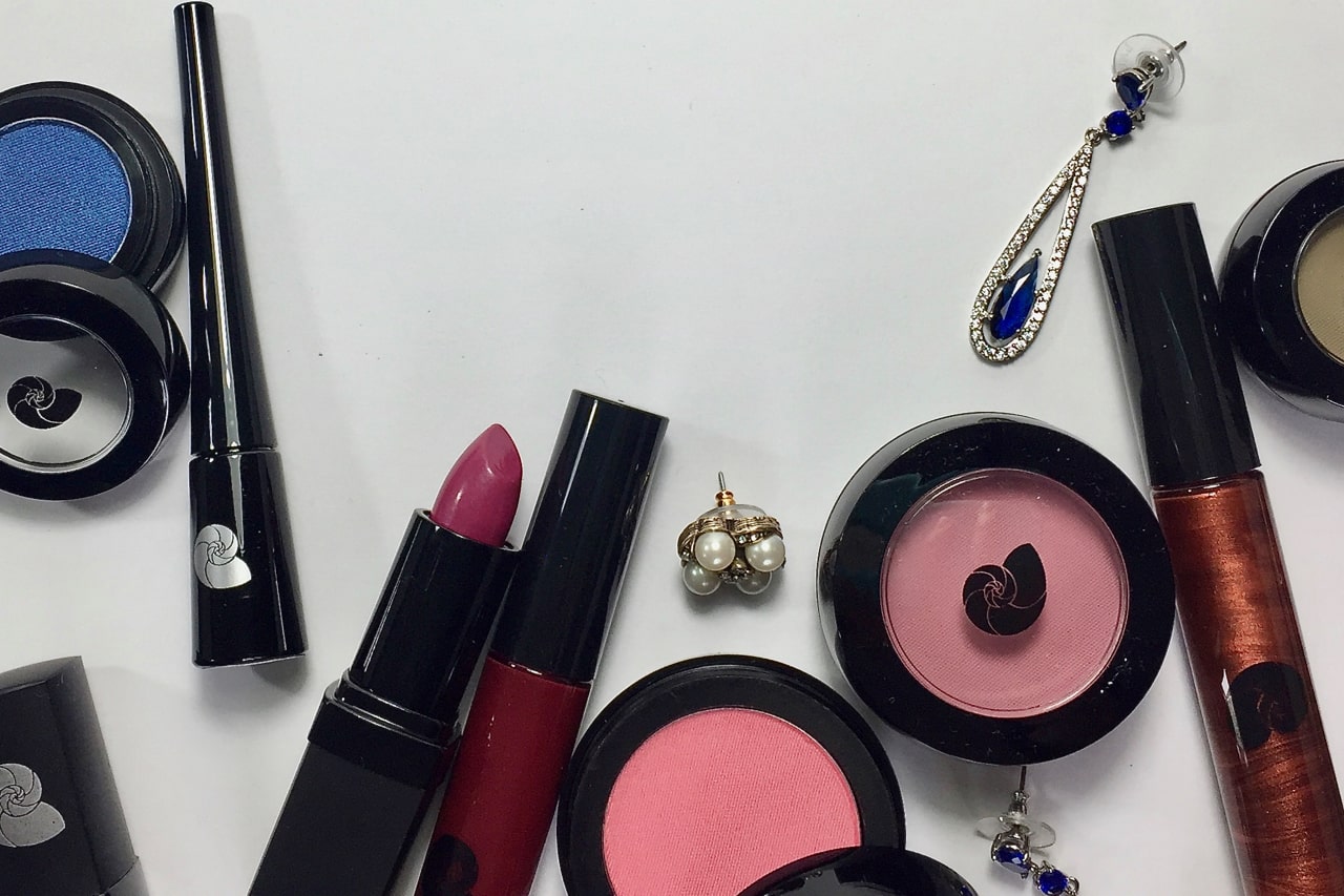
  • lipgloss, with or without lipstick
  • light golden-pink uplighting on cheeks, brow bones, or lips, reserving shine to one or two features at once and choosing between uplighting and bronzer effects to maintain the light and delicate impression
  • bronzer is believable in the warm Seasons, keeping the colour delicate, such as pale golden apricot, and the amount sparing for this Neutral (not fully warm) Season
  • eye shadow is light in colour and pigment deposit relative to the colours at the cosmetic counter;  matte to satin finishes recognize Summer softness
  • Spring is optimistic and game to try new things, welcoming a surprise here and there, perhaps a cloud of colour in the eyeshadow design and a twinkling earring in the same colour,  extending the natural wit and good humour of Spring

True Spring 

For True Spring, try: 

Reflected light is warm and clear. Transparency enhances the light with  a lit-from-within effect.
  •  just enough powder to dry the skin so the next product doesn’t stick; translucent powders with a slight yellow or peach tone may blend more imperceptibly with skin, compared with near-white colours that may appear ashy or chalky
  • cream cosmetics may be a lovely continuation of the skin, although finely milled powders are perfectly capable of blending with skin as well; a variety of skin textures are found within every Season and powders may be best when skin is textured
  • don’t be too cautious with lip colour; although  one woman’s healthy is another woman’s bold, True Spring is illuminated by wearing colour in lipstick, with eyes that dance,  hair that sparkles, and the overall sense that sunlight  is beaming from the inside out
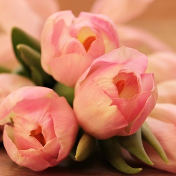
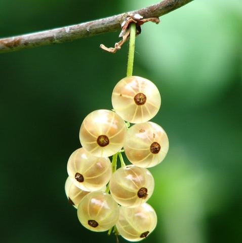
  • lipgloss improves all things Spring; aim for at least the level of shine in the berries in the image above, both for the cream sheen and to keep light in delicate motion
  • eyeshadow can be satin or matte, your preference; matte is easier on mature skin; a soft warm gleam from the highlight extends the smooth shine in the skin, again referring to the berries above rather than the hard, cool, flat shine from a mirror
  • warm radiance is the height of True Spring; peach or apricot-gold bronzer,  medium-light in colour and application, continues the natural warm and sunny colouring; shimmer works well to simulate sunlight;  the area of application is the same (a 3-shape on the sides of the face) with a lighter application possible across upper eyelids or bridge of the nose for a sun kissed effect
  • uplighting cheek and brow bones is another option, in the same colour as Light Spring or perhaps a touch warmer and darker; if the colour swatched on paper and viewed in natural overcast light could slide unnoticed among the colours in your palette, it may be an excellent choice
  • you may find suggestions for lipstick colours in this Season that are predominantly orange but over time, these have not been my preference; they seem unnatural, plastic or artificial, since blood is not orange (although great for a woman seeking a cruise-wear effect); red adds passion and excitement to lips and cheeks and looks more from-within; compared with other Seasons, these colour have an orange quality, peach for Spring and copper in Autumn, but enough red (as coral or rust, respectively) give a healthier appearance
  • in general, True Spring is a moderate Season in which  extremes (besides warmth and shine in jewelry) may not find a home ; shine in one or two features is enough particularly in mature faces; Spring has great versatility with shine and texture in fabric but the higher levels of shine might be reserved for apparel, accessories, and jewelry

Bright Spring 

For Bright Spring, try: 

Compared with True Spring’s berry image, these cherries separate more from the background, the overall effect is darker, and the placement of highlight more strategic. The surface is still smooth,  plump,  would be warm and soft to touch, and would not be improved by intentional shading. Of course, facial shapes are varied within Seasons, but thinking more about how light is reflected than the shape itself, and that contouring and highlight at once may be serving two masters and diluting both effects, on this surface, this type of highlight is more convincing.
  • sharper edges and angles with more deliberate placement of shine, along upper edge of cheekbones and eyeshadow highlights
  • lighter, cooler uplighting products than True Spring wore; to avoid the hardness of platinum and the coolness of silver, and because the area of application is small, Light Spring’s shine product may be well suited
  • while far from dusty or muted, these colours are too warm to qualify as icy and this may be one of the few examples in which rose gold might serve perfectly in cosmetics
  • in apparel, the more pure the colour Bright Spring wears, the better they look; this extends to cosmetics also, and multicolours and colourful colours are perfectly at home; coral eyeshadow, turquoise eyeliner, and warm fuchsia lips may look perfectly fine, separately or together, because this is how the colours in the face are assembled
  • keep in mind that cosmetic pigments may reach an intensity or level of saturation that is not found in human beings; human colouring always includes a degree of neutrality as the red of blood is filtered through the yellow, brown, and blue pigments in the skin, moderating the intensity of the colours
  • for the woman seeking a quieter cosmetic effect, choose transparency in the product rather than softening of colour or subtraction of pigment; safe colour tends to dull the complexion and drop the energy
  • to repeat the natural appearance of wide colour transitions between the features in the face and the colours in the palette, cosmetics can create distinct separation of features from skin (a form of contrast); cosmetic colours are far from the canvas of the skin and from one another for a look that’s lively, not blended
  • more contrast as Winter arrives, meaning more distance between lights and darks; highlights on cheekbones and brows are seen at the same time as eye makeup, pointing out that the colours defining the eye should be dark enough to create the light-dark separation from the highlight
  • sparkly jewelry, with a twinkly or glassy reflectivity; jewelry has more flexibility than cosmetics but does tend to be seen in the same visual field and metals or stones with a dense or chalky reflectivity may appear heavy; don’t be too exclusive though, a pure coral or turquoise stone might be amazing; imagine the item hanging from a branch in a rainforest scene with a waterfall
  • use glitter in nail polish but keep it delicate, like winking;  a little artifice and  extreme are lovely with the  energy, youth, and wit expressed with Bright Spring but delicacy always applies

Recap 

The skin is dewy, adapted to the natural texture to create an impression neither oily nor dry but somewhere in between. The features are fresh, lively, and distinguished from the skin by being colourful, moist, and vibrant. 

The 3 Spring Seasons are warmer than they are cool. For shine to be successful, it must follow this guideline. Warm shine is ivory, peachy, or golden.  Cool shine is silvery and would feel colder;  when light arrives, the reflection approaches white or blue causing warm-coloured skin to lose vitality.  Cool light cannot mesh with the skin and has nowhere to go but back out, sometimes giving rise to an over-reflective and slightly greasy or sweaty effect. Cool light also has no position from which to harmonize with the other cosmetics, hair, jewelry, and apparel, as if we don’t match ourselves.

Silver jewelry with a warmer tone can be lovely next to warm-neutral skin (Light and Bright Spring) and has the  advantage of mirroring the natural colours of skin to a degree.

Christine Scaman is located in Prince Edward Island , Canada. In addition to in-person Colour Analysis, Christine is also an instructor for the Colour Analyst training program. Please click the link buttons below for more information.
Christine Scaman