12 Seasons
"Beauty will always present itself as one unified whole."
The above quote by Kathryn Kalisz, the founder of the Sci\ART system, seems logical and straightforward. The challenge, however, is to bring it to life…
Personal Colour Analysis is both an art and a science.
This is true of many skills practiced at their highest level, with examples such as cooking and medicine in all their forms. To discover the intrinsic colours of our body, which includes our own version of each colour in the rainbow, the colours already present in our skin, eyes, hair, teeth, and every other feature, our process strives to bring artistry and scientific method into balance, as Nature always offers them.
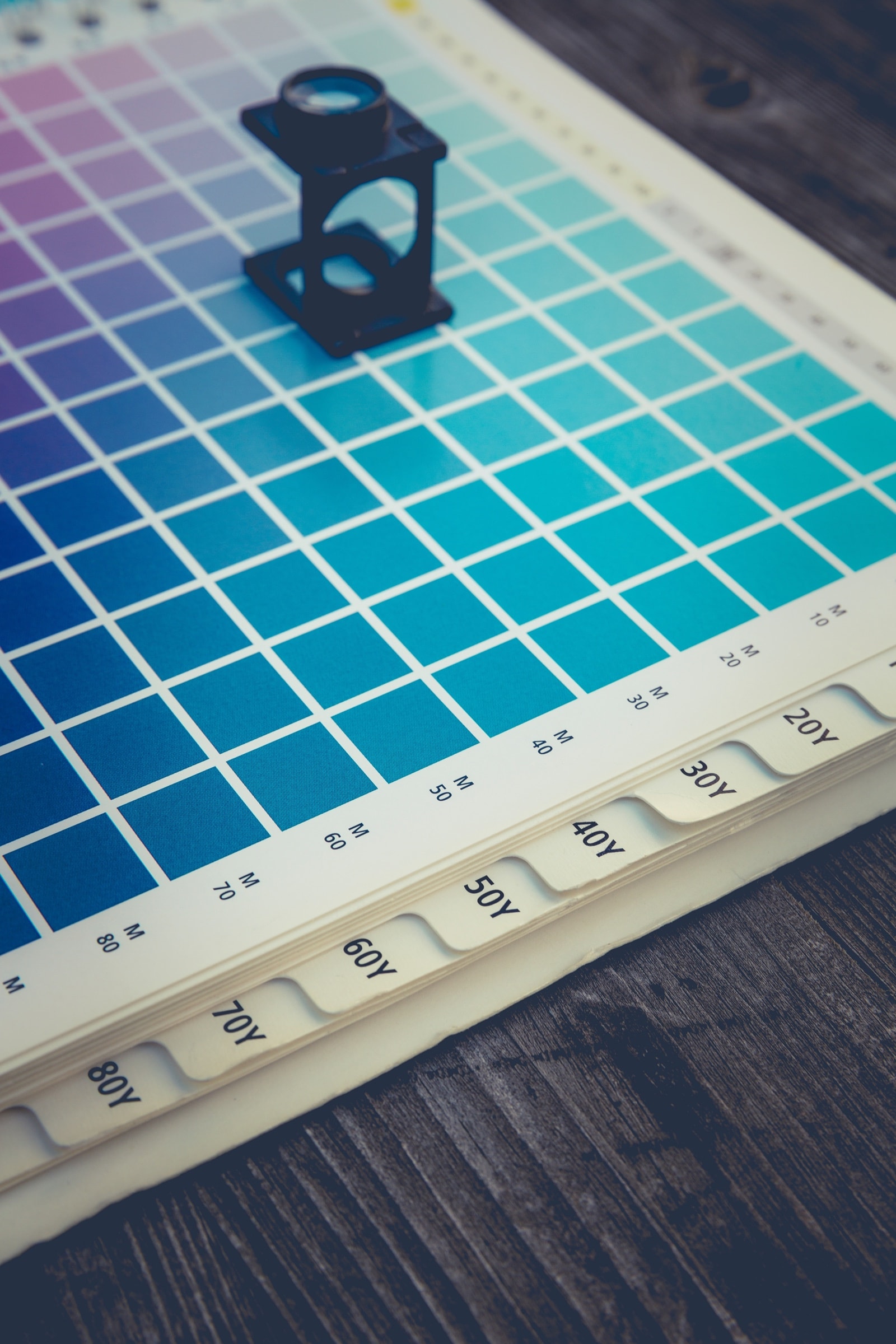
The 12 Seasons are based on the colour collections designed by Sci\ART founder and Master Munsell Colorist, Kathryn Kalisz (1948 -2010). The Munsell Color Order System is recognized as the worldwide standard for colour communication. It’s the colour system based in how humans see and it can accommodate new colours with the passing of time, colour technology, and trend in fashion.
Kathryn understood that 4-Season systems were not able to represent the many variations of human colouring, but when the number of groups became excessive, the energy and expression of each group was diluted and our ability to discern the colours was too challenged to be accurate. She determined that 12 Seasons was the perfect number. It was also clear to her that colour appears and behaves in three related dimensions, which have been shown in diagrams as length, width, and height, creating a structure that resembles an irregular tree.
Three Colour Dimensions
Colour must be organized according to three interlocking variables, namely the hue, value, and chroma. Each of the 12 Seasons differentiates itself from the others by its specific combination of these three variables:
HUE refers to the colour family, such as red or blue. Our associations with a colour are largely based in this quality, as we find red to be passionate and yellow to be friendly. In combinations, we make deeper connections with colours. For example, Autumn palettes contain both red and gold and we feel the simultaneous presence of gold and rust as rich and dark, as well as warm. Hue is also related to the temperature of a colour, such that warmer colours generally contain more yellow and cooler colours are bluer.
VALUE refers to the position of a colour on a light to dark scale, or how it might appear on a black and white television. Humans are very skilled at seeing value, and even more so when offered more than one value to compare. As a result, value may be overemphasized in our assessment of a colour or an individual’s colouring. This tendency is neutralized or brought into balance with the other two dimensions by an accurate testing system.
CHROMA or saturation speaks of the grayness or clarity of a colour. Low chroma (softness/muting) might be described as dusty; essentially, it means how much gray is visible along with the pigment. High chroma colours contain very little or no visible gray, making them brighter/clearer. They appear lively and energetic, and seem able to step forward in our awareness, and in front of the person wearing the colour if the individual is more muted in their colouring. Fortunately, when we wear colours in harmony with our own, our attire looks beautifully energized and so do we.
Colour Classification into 12 Seasons
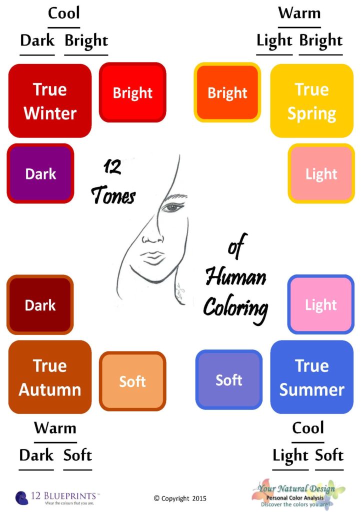
The colours found in each of the 12 Seasons are based in Kathryn’s expertise in colour classification, as well as her virtuosity in the psychology of human colour perception. Kathryn’s scientific contribution extends beyond allocating hundreds or thousands of colours to one of 12 Seasons.
Each colour has a distinct chemical behaviour in pigment mixtures and a certain behaviour in compositions. Although each colour belongs to one Season only, many resemble one another. Their home Season is determined by their interaction and relationships with the other colours within that Season. To assign colours to Seasons, Kathryn understood how Nature creates visual agreement from mixtures of pigments with distinct properties. Kathryn’s genius allowed her to juggle these many factors at once to result in colour groupings that we humans perceive as visually harmonious when we observe the entire palette.
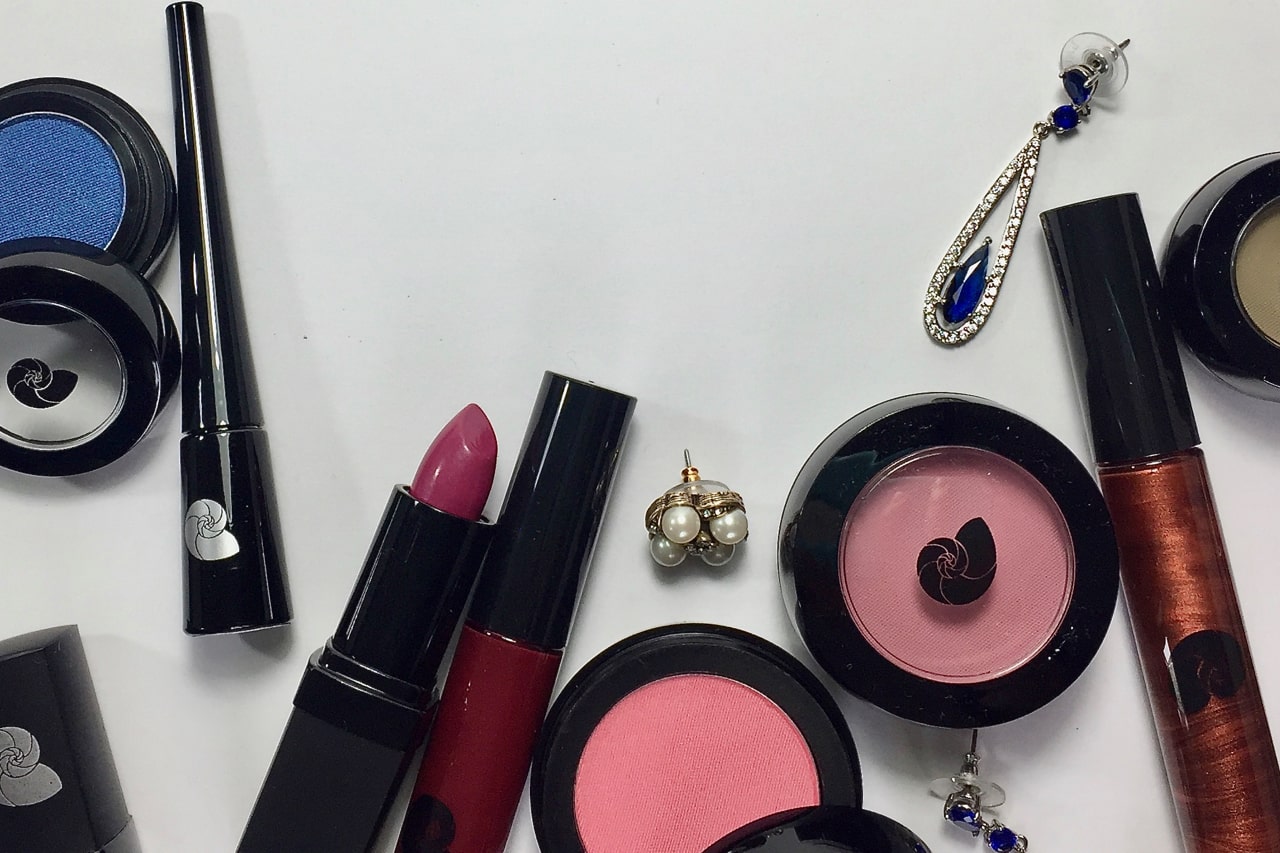
The 12 colour collections, or 12 Seasons, that Kathryn developed are the platform for the consistent structure found in the 12 BLUEPRINTS and Your Natural Design analysis systems employed by Chrysalis Colour analysts. The system begins with the testing colours used in the analysis and follows through every step thereafter, including Luxury drapes, client education, and application of Season for attire, cosmetics, and hair colour recommendations.