Harmonizing Tips

How to Use Your Colour Fan

After your analysis, you’ll receive a colour fan that has examples of your best colours. It is meant to help you take the amazing results from your draping to your wardrobe. Using the fan to identify only your most flattering colours is a skill that may require some practice. Do not be concerned about this since it applies to everyone. With the help of your colour analyst and the tips below, you will progress rapidly and make confident, successful decisions.

In the beginning, aiming to match colours to the swatches in the palette is a great place to start. Many find this to be such an improvement in their appearance and wardrobe organization that they are satisfied to continue with this method.

For those who desire a more discerning method of choosing their Season colours, another level of colour sophistication exists. The palette is a representation of the thousands of colours that would be in harmony with your Season. Your growing knowledge of your colours will direct you to many items that are not exactly pictured in the fan and would make wonderful purchases. Also, one or more colours in differing Seasons may be similar and to make the best choices, you may prefer another method than ‘dot-matching’. 

The tips below will help you look for true harmony.

Colour Harmonizing 101

As with your colour analysis, you know you’re right when the palette looks vibrant, healthy, focused, and beautiful. The fabric will appear colourful, supportive, and belonging. Together, they seem to enhance one another. A little knowledge goes a long way!


Basic Technique

Refer to your Season's Colour Fan

QUALITY OF LIGHTING:

Determine whether the light is appropriate for matching. Daylight on an overcast day is best, but not strictly necessary.

In general, artificial lighting is problematic because it’s not full spectrum.  Direct sunlight, yellowed incandescent light, green or blue fluorescent or otherwise coloured lights, or coloured casts from wall paint, curtains or sunscreens are a no-no, as they influence the colours that you perceive in the fabric or garment.

Step 1

Open the fan up into a full circle, so that you can see all the arms and there is maximum space between them. Place the open fan on the fabric.

step 2

Don’t focus any attention on how well the fabric colour appears to match a particular dot. That only interferes since several different Seasons can appear to match with a dot from your fan. You can even cover up any strip that’s a close match to prevent dot-match.

Let the fan and fabric get a bit blurry together, by relaxing your eyes or squinting, so that no one detail stands out.

step 3

When the fan and the test fabric/colour are the same Season, there are two optical illusions that can happen:  i) the fan seems to merge into the fabric, no longer appearing separate. This is a subtle effect and will require some practice to recognize. Think of a scenery painting to which another big stroke of colour is added. Either the new colour belongs, and the whole thing resonates, or it feels off, and the stroke seems to hover or separate from the painting.  ii) the fabric and the fan make each other sing/come alive /radiate. It’s exciting, it hums, both the fan and the fabric look more beautiful together than they do apart, like there is a glow from them, like a light got switched on, the same as in your face.

step 4

Not sure yet? Staring at the fan on the fabric doesn’t help – it can just start to look normal. So pick the fan up and drop it a few times in a row to test for the feeling. Harmony effects are easiest to see right when you first drop the fan onto the fabric. So rather than continuing to stare at the fan sitting on the fabric, pick it up and drop it on again. Do this several times in a row. In between, look away for a couple seconds.

Look for an overall feeling of wellbeing and balance. The full palette and the fabric feel calm, strong, and mutually cooperative. The palette looks fairly flat on the fabric, neither floating or sparkling above nor fading with a ‘running out of gas’ effect. The individual swatches are settled, colourful, and in focus, with no sense of having a halo, being difficult to look at, or wanting to look away.

additional tips

attention divided equally

Ask yourself whether your attention is divided equally. If some colours, often the yellows or warm reds, seem very strident or insistent at the expense of other colours, the choice may not be the best. If you find yourself noticing all the darker colours of the palette and ignoring the light ones, or if the light ones appear suddenly grayed, the choice may not be in your favour.

reds

You can also use a few fan arms at a time. Pull out the red (lipstick) arms only, and drop them on the fabric. Would you want to wear that lipstick with that item? Or does the lipstick look muddy, or dull, or garish? Too candy pink? Do the cooler choices seem frozen, or ‘purple Popsicle’ rather than healthy and fully pigmented? Too strangely orange?

greens

Try the green strips. Green has a particular property of being either ‘great or gross’, which is very helpful in making decisions.

similar colours

Separate the strip containing the swatch closest to the fabric. Could the fabric colour slide in among the swatches and nobody would notice? Or does the row of swatches seem suddenly irregular, with your attention divided unequally among them?

combinations

Consider a few combinations. Which colours look well together may be a matter of personal taste, but you should not encounter combinations that look unimaginable, unhealthy, or conflicting. The feeling is often one of ‘energetic equivalence’, meaning that, for a blue garment, it is as blue as the swatch is blue, or it is as blue as the greens are green. If you feel the need to step up or down from the swatch to reach the garment, an imbalance may exist.

in harmony

If you have fabric or clothing available that you know is in your Season, you can check the item in question against what you already have. Look for the harmonious connection, the enhancing of each other. If you have several fabrics or items of clothing, even better. If the match is wrong, your eye just sees that mismatched item immediately - "one of these things is not like the other". (It can also help to compare the proven Season clothing item to the fan again, to remind yourself how a match with your fan looks/feels.) If there is a Season that you tend to get fooled by, bring an example of that too, so you can remind yourself what that ‘no’ looks like.

overall effect

Finally, put the fabric against your face. Wearing the item is what’s it all about! Look for dewy skin, definition without harshness, and your eyes taking centre stage, with depth in the eye colour. You want it to feel good, that “born of each other” that we saw between your face and your drapes.

Harmonizing

How to Harmonize Prints and Patterns

In the beginning, solid colours are much easier to match than patterns, so practice with those first. 

At times, a pattern may contain colours from several Seasons. When deciding on a print, if the print’s colours are all over the map in regard to Seasons, it’s best to not choose that one. 

However, if 80% or more of the colours were in your Season (i.e. mostly True Autumn colours but with a bit of True Spring orange) then generally it will work. A good test is to see how it looks from a distance. If the primary Season is reading as being predominant, then the pattern will work well enough.

How to Harmonize Dark Colours

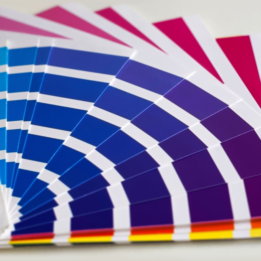
You may notice the colours at the outer edges of the strips more than those in the center. Both lightest and darkest colours should appear colourful and energized, without a sense of losing the lightest colours next to the fabric, or the darkest colours being too bold. Open the fan as much as possible – perhaps observing fewer strips at a time, if this will give you a better reading.

It’s easy to place too much emphasis on darkness or misjudge a colour’s other properties, such warmth and brightness. Comparing dark fabrics to the dark colours in the palette (and light fabrics to the lighter colours) may help comparisons be more accurate by keeping one variable more equal.

keep in mind...

While it’s useful to know your place in the 12 Season circle and the differences with your neighbouring Seasons, it’s not necessary to recognize all other Season’s colours. For your purposes, a colour is either YOU or NOT YOU. If it’s not you, there is no need to spend effort identifying what other Season it might be.

Second-hand stores tend to have more colours to choose from than regular stores, which are limited by trend or time of year. Inexpensive purchases are a wonderful way to introduce your eyes and your closet to your colours. Your level of discernment will improve so rapidly that within a year, many of these purchases may be replaced with permanent contributors to your wardrobe.

Finally, while most of the advice above is meant to help you get it right, there is no need to have everything perfectly matched. Sometimes you just need clothes. Or it could be that the cut of something was so perfect, you can forgive the colour. All of us, occasionally, buy things that are near enough to our Season to work in our wardrobe. Just taking most of the wrong Seasons out of your wardrobe already does wonders.

This technique was first discovered by Terry Wildfong of Your Natural Design. With time and practice, the process has been refined to become a system in its own right.. We are grateful to Terry for this important contribution to colour analysis, which opens up a universe’s worth of colours from a single palette.

*Adapted from Lisa Kelly, Spring 2016 @ DNA My Colours