Studio St.John
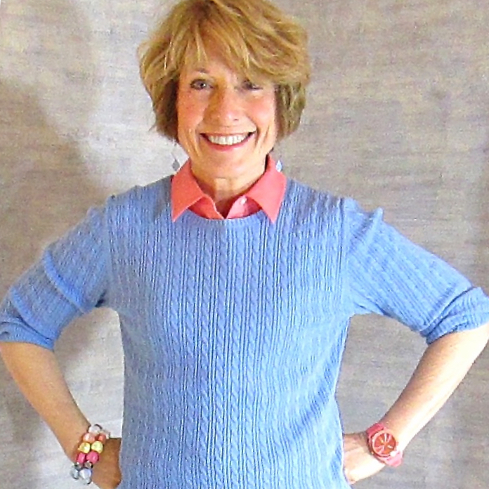
Courtenay St.John
Business Hours :
Daytime, evenings and weekends available by appointment.
"WHEN YOU ARE LIT FROM WITHIN, IT’S FUN TO GET DRESSED!”
STUDIO ST. JOHN
Ordinary men and women of all ages have a personal vitality that flows when they wear the colors that align with their skin-tone.
No matter what your age or how much you weigh, whether you have the bloom of youth going for you, or whether you are older, your natural coloring is inherently fascinating.
The fashion and make-up industries have banked on us abiding by the trends they create. In an attempt to appear fresh and modern, we may choose colors that conflict with the inborn coloring that holds our true sparkle. This has jarring effect, sometimes subtle, sometimes blatant, on many who wear these trends, even if the wearer is young and lovely!
A 12-tone Personal Color Analysis will save your time and money because you will learn to read your skin’s reactions to color, and become the personal expert on which colors look best on you. Your newfound radiance will be compelling for both you and your “viewers.”
Studio St. John is committed to this result for you!
HOW DID IT COME TO THIS?
Getting dressed to teach each day, to go dancing, or even to go hiking used to be an exercise in frustration for me. Nothing in my closet coordinated. Another pair of shoes or a new accessory was needed every time I added a new article of clothing. The persistent refrain, “I have nothing to wear,” popped up whenever a new event was on the horizon.
I had my “colors done” in the 1980s and was found to be a Summer. Many of the clothing items purchased at that time remained unworn in closet 25 years later! I tried to diligently incorporate the Summer palette into my choices, and to wear the “universally slimming” black on the bottom, but my face seemed to be permanently gray and harsh, and looking worse as I aged.
A Personal Color Analysis, based on the 12-tone system used both by the Sci/ART and 12 Blueprints methods, revealed the light, warmth of my skin tone. Gone were the dusty, more muted tones of Summer and the blacks of Winter, and in bounced the gentle, sparkly warmth of the Light Spring. I couldn’t have been more surprised!
The adventure continued when I became a Color Analyst, trained by Christine Scaman of 12 BLUEPRINTS, 5 years ago. My prior background couldn’t have been more distant from this training. Teaching math (MS), logic, linguistics (PhD), and dietetics (RD) are still consuming interests. The common elements unifying these vocations are a passion for analysis, and a patient approach to finding solutions to problems.
Watching family, friends and clients shift from an appearance characterized by a mismatched disarray of clothing color choices, to a one that reflects coherence and wholeness, is a delight. The world will take notice once you have taken the leap that embraces your natural color palette in clothing and make-up.
YOUR COLORS
Look forward to opening your closet and finding that:
- You now have a “wardrobe,” instead of a closet full of clothes.
- You will shop preemptively and strategically, and quickly return those online purchases that compromise your coloring.
- You already own the dress you need for that upcoming wedding.
- Your husband thanks you for looking so great.
- You look in the mirror and think, “Wow.”
- Toll collectors, sales clerks and perfect strangers notice and spontaneously comment on your unique color sense.
VARIATIONS ON A THEME: WARM NEUTRALS
Four of the 12 seasons are considered to be warm neutrals. The warm – neutral designation refers to a skin tone and color palette that are more warm than cool, but are not predominantly warm. This type of warmth is classified according to the warmth of its parent season – either Spring or Autumn.
The distinguishing characteristics of the warm neutral seasons are brightness, darkness, softness (muted) or lightness. The combination of Spring, and either lightness or brightness, or of Autumn warmth, and either darkness of softness, describes the 4 warm neutral seasons: Light Spring, Bright Spring, Soft Autumn, and Dark Autumn. Below, an example of each warm neutral is shown in a before/after format.
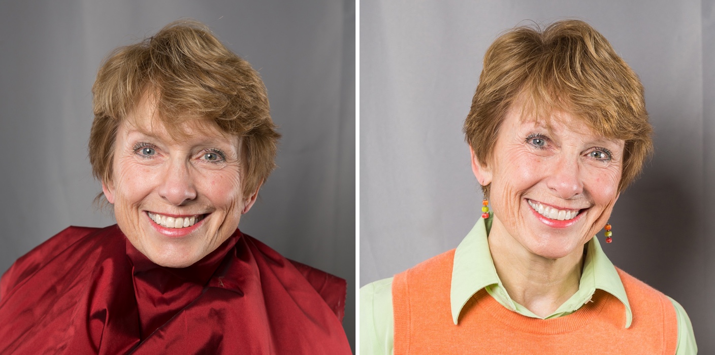
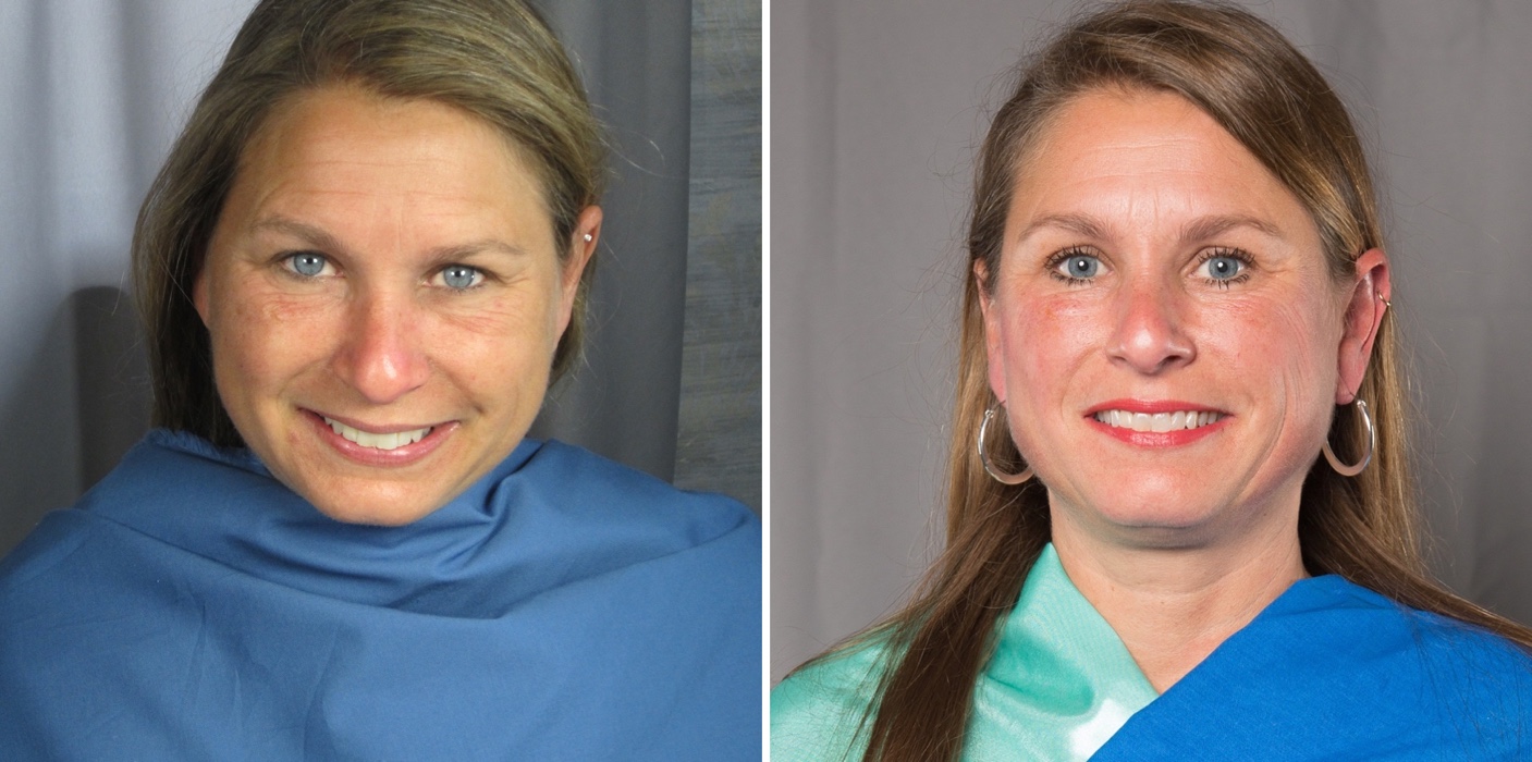
LIGHT SPRING
The make-up Virginia is wearing is identical in each photo. On the left, she is overpowered by the heaviness/darkness of the dark autumn drape. Her hair is duller and eyes appear to be closer together and less twinkly. The lip color is the same, but on the right, in the Light Spring clothing, it looks vibrant, and provides a contrasting sparkle with her eyes. The peachy glow of the blush disappears next to the dark autumn drape on the left, but is an innocent flush on the right.
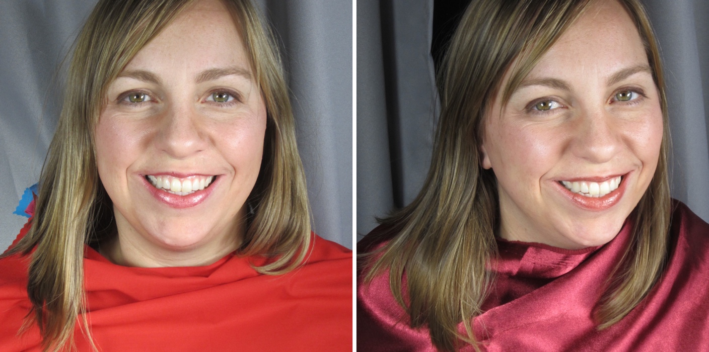
SOFT AUTUMN
On the left, Leslie wears a drape that is bright orange/red, and on the right a soft autumn drape. Her make-up is the same in both photos. Her hair color (natural) fights the red drape, and almost looks green. Her face sits apart, on top of the red drape. The viewer is left unsure of where to look. Her eyes appear unremarkable.
On the right, true to her Soft Autumn coloring, her eyes sparkle, and our eyes easily flow from the drape to her hair, to her eyes.
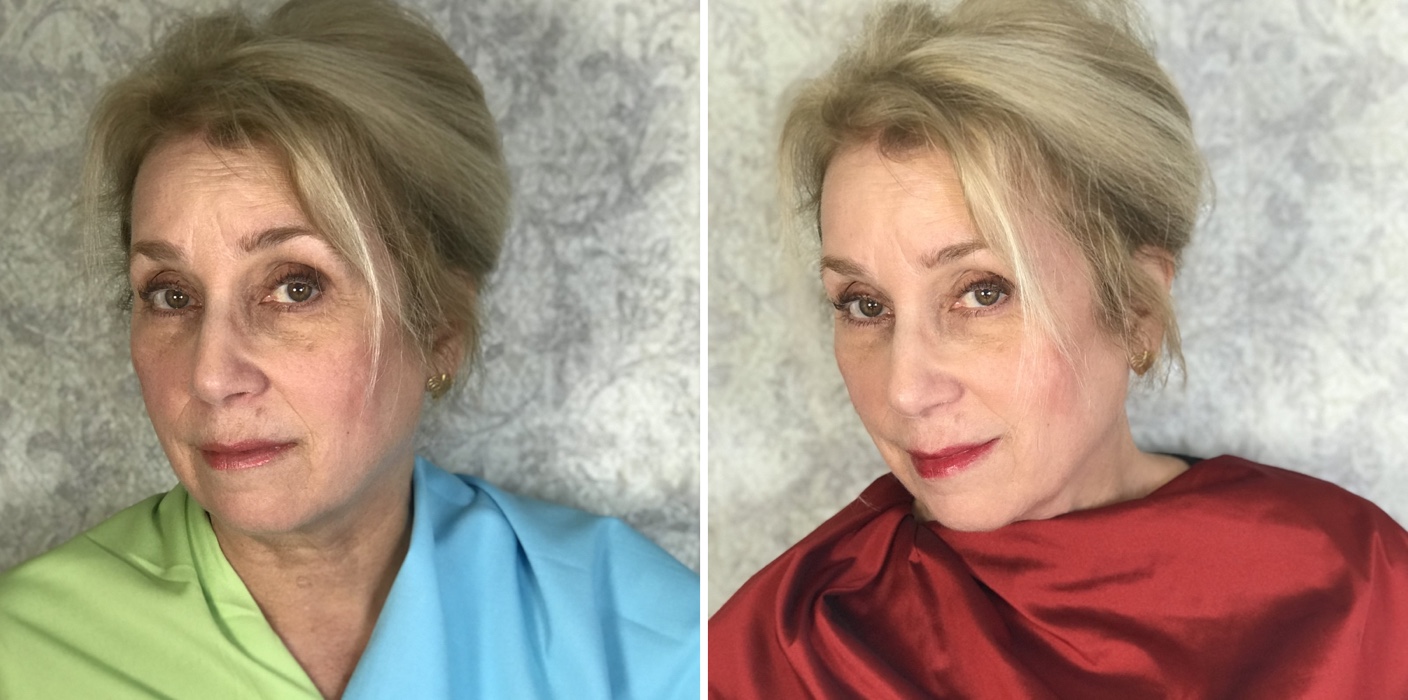
DARK AUTUMN
In both photos, Jenny is wearing the same foundation and blush. On the left she is wearing a Light Spring lipstick, and on the right a Dark Autumn lipstick.
Light Spring (left) ages Jenny’s face, adding gray tones to the skin and hair, and increasing the visibility of lines and blemishes. On the right Jenny wears a Dark Autumn burgundy drape. In this image, the same foundation and blush look just right. Both the Dark Autumn drape and lipstick draw our attention to her eyes, which exhibit added depth and intensity. Her hair and skin sparkle; her jaw appears to be more slender.
BRIGHT SPRING
Anne’s blue eyes changed to match any blue drape that was tested on her. She had gone through life believing that if it was blue, it matched her eyes and this was good!
In the photos above (make-up free on the left), Anne is wearing blue, and indeed, her eyes have assimilated to the color of the drape and are a stunning shade of blue. However, her eye whites are reddened on the left, her brows are thinner, and her eyes are more closely spaced. Alternating brown and red tones smatter her face, creating an uneven effect.
In Bright Spring make-up and drapes, her eye whites and teeth sparkle, and the viewer is immediately drawn to her blue eyes. The brown tones have disappeared and her skin is an even, rosy pink; even her hair sparkles.
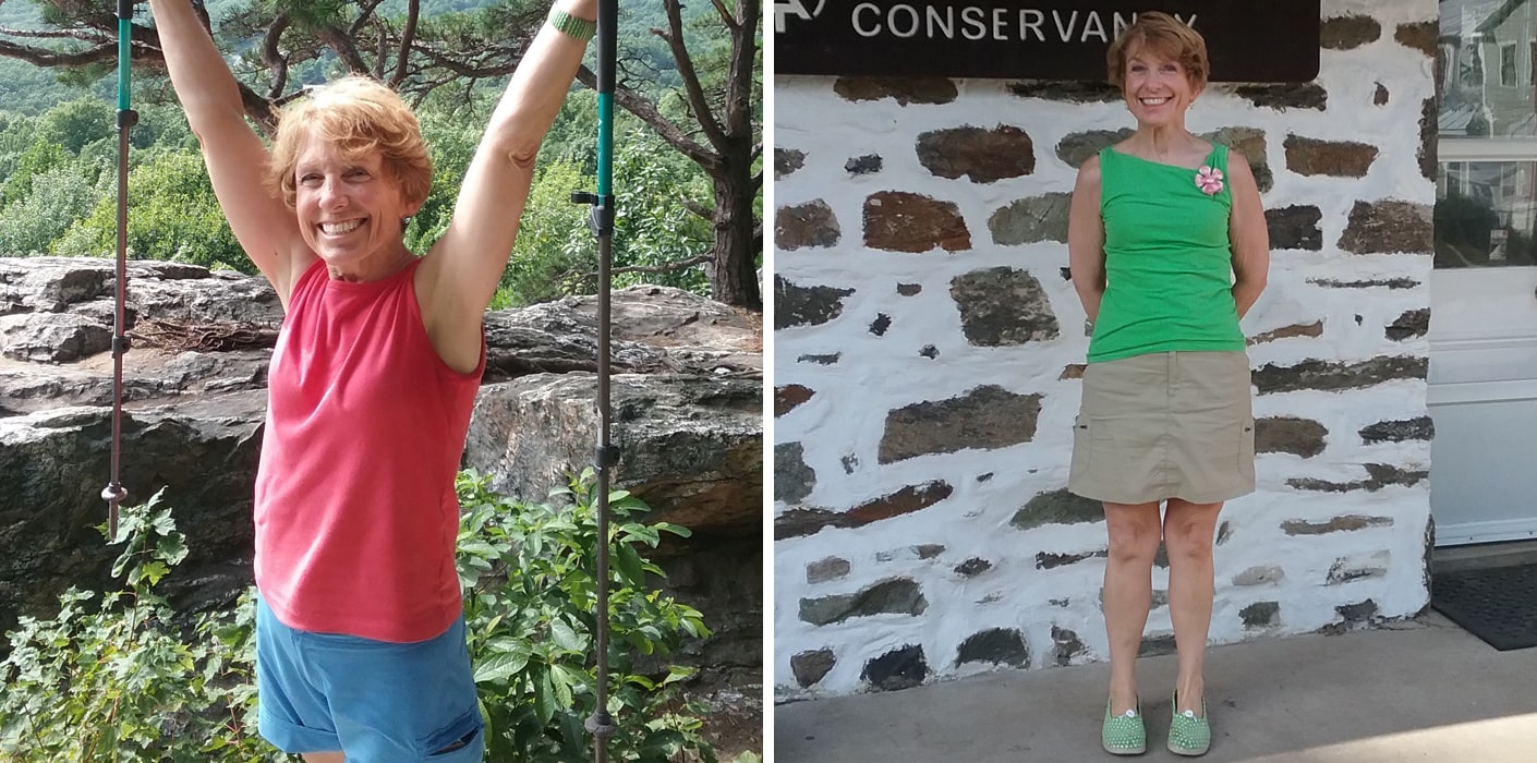
HIKING… IN COLOR
Hiking in the jelly-bean colors of Light spring was challenging at first – now it is second nature.
In 1999, as “Dessert First,” I began my section hike of the Appalachian Trail, and covered roughly 120 miles each year, completing the last 14 miles of the 2,180 mile trail in 2017, in Harpers Ferry, West Virginia.
The photo on the left illustrates the warmth of light spring colors, both in my skin and clothing, which stand in contrast to the summer blue-green tones which surround me. On the right the contrast is less, because the backdrop of the wall more closely approximates some of the browns and grays in the Light Spring palette.
A Personal Color Analysis is transformative.
The 12 BLUEPRINTS and Sci\ART methods of analysis provide the tools and training for analysts to conduct this discriminating process. Look forward to your enjoyment of a PCA with any analyst who has trained with Christine Scaman or Terry Wildfong.
MY LOCATIONS and TRAVELS
Studio St. John is located in Traverse City, MI.
Studio St. John is located in Norwalk, CT (one hour from New York City).
Studio St. John travels to:
- Washington, DC
- Charleston, SC
- Fairfield, IA.
Please check my website for contact information and upcoming travel dates.