Your Colour Harmony Inc
Elaine DeFehr, BID
Business Hours :
By Appointment Only
Colour relationships for you, your wardrobe and your interior environment
Your Colour Harmony Inc
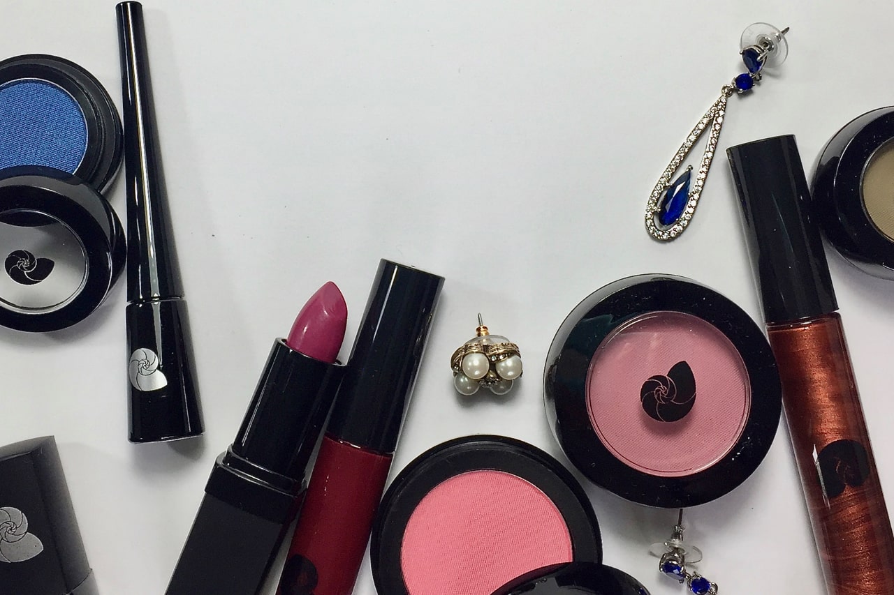
The best colours that go with a person’s skin overtone and undertone, eye colour and hair colour are colours that harmonize with the colours of the skin tone, eye colour and hair colour…which translates into colours that harmonize with you….Your Colours in Harmony….and therefore ….
YOUR COLOUR HARMONY
elaine's history
Growing up in my Mom’s hair salon gave me the observational environment of personal aesthetic transformations in many of her clients throughout the years. I witnessed the fashions, the hairdos, the cosmetics and the evolving style trends of colours.
As an only child, my Mom always knew she could keep the once shy side of me pleasantly entertained with blank surfaces and a colourful assortment of artistic tools while she tended to her customers in endless conversation. This childhood experience and passion has led me to a rewarding career in the field of Interior Design.
My work experience was in the Marketing and Communications Department for a corporate furniture manufacturer. My Interior Design scope of work included Facilities Management, Designing and Project Management of 10,000 sq ft – 80,000 sq ft of Corporate and Retail Showrooms within North America, with a team of colleagues, from conception to completion, and Designing Staged Sets for the Corporate in-house Photo Studio.
Later, as a stay at home Mom of two, I took on small Interior Design projects to aid clients with the selection of colours/neutrals and finishes for their interior. These little projects were immediately gratifying for the client and me. The experience made them happily satisfied, sometimes ecstatic, and sent me back home feeling amazed that I could be of such personal influence.
My most recent Interior Design experience has been in the field of Hospitality with regards to short term condo rentals. The goal was to maximize efficiency for the buyer with regards to gathering the trades, having the designer connections to make purchases that meet a budget, selecting the best option from what is available, all managed within a concentrated time to be welcoming for the first occupant.
personal colour analysis
I have always loved colour specification and continued to research that area. I thought Personal Colour Analysis would give me an edge in the Interior Design market. The two fields have their differences but in general, the Colour Theory is universal.
In 2015, I completed the 12 BLUEPRINTS intensive training program in Personal Colour Analysis to complement and enhance my career endeavours. That same year, I opened my Personal Colour Analysis studio where I have served clients through word-of-mouth advertising, as I continue to balance family life with interior renovation contracts.
A Personal Colour Analysis client visit is just as rewarding for the client as it is for me. I can sense the client’s feeling of empowerment through their understanding of this newfound colour knowledge. This connection is really incredible!
PCA & Interior design
Personal Colour Analysis (PCA) can enhance the user’s experience in the private and public spaces of a client’s interior.
With extensive colour theory and lighting knowledge, the Interior Designer knows how to find the best solution to enhance your desired experience. When selecting the colours and finishes for a personal interior environment, I aim to understand the client. A series of questions spark up a conversation to gain this knowledge. Another technique I use, if the client is not so confident at expressing their likes and dislikes, is having a look into their wardrobe. Here I can see what classic wardrobe items she/he has hung onto, what trends she/he were swayed by and how expressive she/he likes to be.
If my client has had a Personal Colour Analysis, her/his private and public interior spaces may be pleasantly enhanced by it. Personal Colour Analysis will increase the visual enjoyment by having one of the client’s seasonal colours in an area where my client is consistently in view by other users of the space. For example, the dining room wall where the client sits in front of, the wall behind the client as she/he looks in the mirror and the favourite high back chair that the client uses. This rewarding technique is also dependent upon the other colours that already exist in the space.
The twelve seasonal colour palettes of Personal Colour Analysis is helpful time saving resource for me. This acquired knowledge equips an interior designer with an immediate focus for areas of a colour field that will harmonize with a selected colour. For example, if I am selecting a paint colour/neutral to enhance the fabric colour for an item of furniture. With the knowledge of personal colour analysis, I can tell what season that furniture colour/neutral is already in. I quickly familiarize myself with colours and theories from that season and focus on one that inspires me. This saves me a lot of time. I will further refine the paint colour/neutral, according to the lighting and other materials within the space.
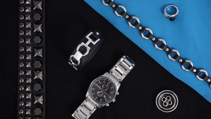
Lighting fixtures, drawer pulls and metal décor accessories are ‘the jewellery of the interior’. Personal Colour Analysis knowledge has also helped me succinctly define which metals perfectly harmonize with an interior finish or colour scheme.
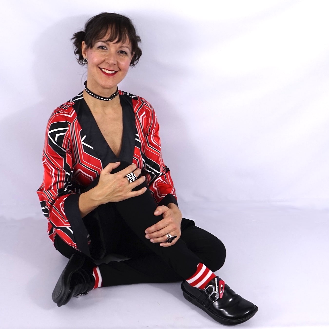
Your Style Harmony
My university education in Design Theory enables me to analyze the design elements of your body type as I would the design elements of an interior. My Art History Education enables me to define what design style best suits the elements of your body, just as I would decide what design style that would best enhance the existing design elements of an interior.
I have offered a ‘beta’ version of my Style Analysis review for earlier PCA clients to get a feel for how they would respond to my new endeavour. It takes time for my clients to process all of the information in addition to their personal colour analysis. My clients have been gracious and the learning process was very rewarding to us both! Nowadays, I offer a Your Style Harmony consultation for my Personal Colour Analyst clients on the basics of their wardrobe style to further empower their shopping experience.
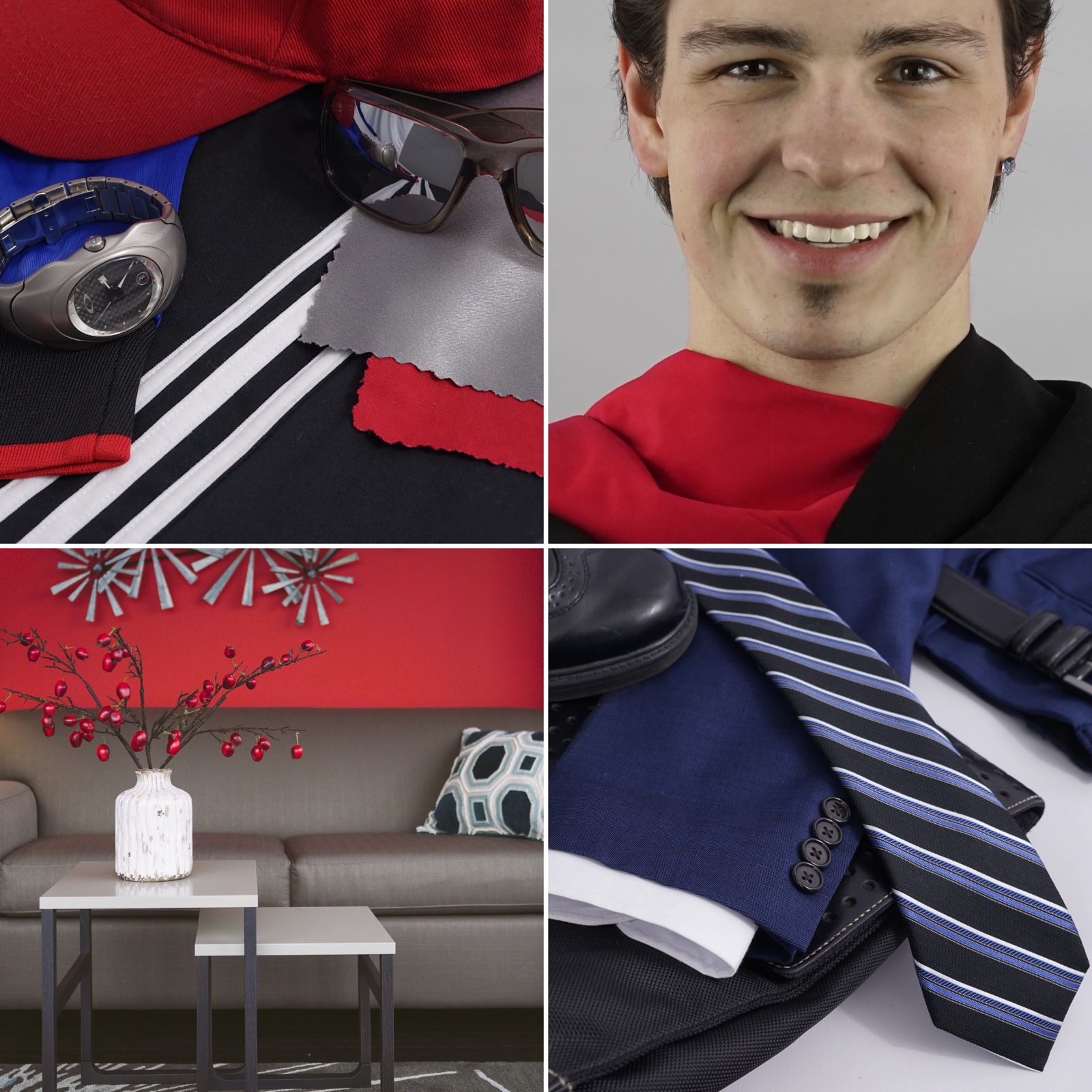
I am able to define the specific design elements of a basic wardrobe that is best suited to your design elements of style in harmony. For example, the shapes/forms, lines, proportions, patterns and textures that you should strive to wear in harmony to enhance your visual self. You were born a pleasing work of art! I strive to educate clients that wearing unfavourable design elements with no regard for harmony, will distract from your overall visual appeal that is seen and unconsciously understood by others.
appreciation
I am grateful for the late artist, Kathryn Kalisz in creating the original language of seasonal colour groups, Sci/ART, which has affected so many lives. I am very appreciative that a Personal Colour Analysis visit to Personal Colour Analysis Sci/ART mentor, Terry Wildfong of Your Natural Design, awakened Christine Scaman’s subconscious mind to visual awareness and stimulated her unfailing analytical passions to determinedly develop 12 BLUEPRINTS into a world class organizational PCA system of visual experience, prominent colour analyst education and rewarding client empowerment.
I am proud to be a part of this colour community!
When you finally find the ‘perfect’ backdrop for your selfie… but its not a wall, lol.