Big distance between everything and everything else, such as:
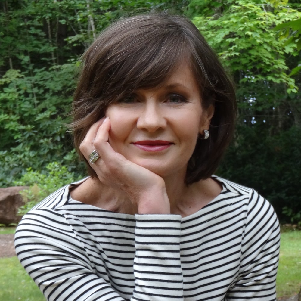
The features from skin. The blanket of skin is even and quiet. Some have ruddiness (which is often exacerbated in soft colours and calmed when wearing Winter colours), many have freckles, but this complexion is rarely the rosy flush. In this even background, add a mouth, cheeks, eyes, and eyebrows whose colours create a big or sudden jump from the background colour. All faces benefit from separating the features from the canvas to the right degree, but in Winters, the degree of separation is bigger because the colour ranges are broad.
 The distance between light-dark levels. As one of the colour ranges, the natural light to dark range is broad. Therefore, the light to dark range of the eye makeup is broad. Eyeliner is dark. The eyeshadow next to it, the lid colour, is a fair bit lighter, although influenced by the shape of the eye. The next band, the eyeshadow contour, is quite dark. The eyeshadow highlight is icy light, close to white. The brow is quite dark, though not darkened much more than Nature designed on anyone.
The distance between adjacent textures, ultra matte to ultra shine. The skin is a quiet, even layer. Snow White’s face isn’t contoured (the lowlights of Autumn), dewy (the highlights of Spring), or cottony (the watercolour effects of Summer). We can feel the step backwards as we imagine each one, as well as our resistance to it. Winter’s canvas is uniform and unbroken, the blanket of snow, consistent and changeless. From this empty space, eyes sparkle, lips gleam. and cheeks are flushed with red or red-violet. The punctuation of features in background has a piercing quality; therein lies part of Winter’s magic.
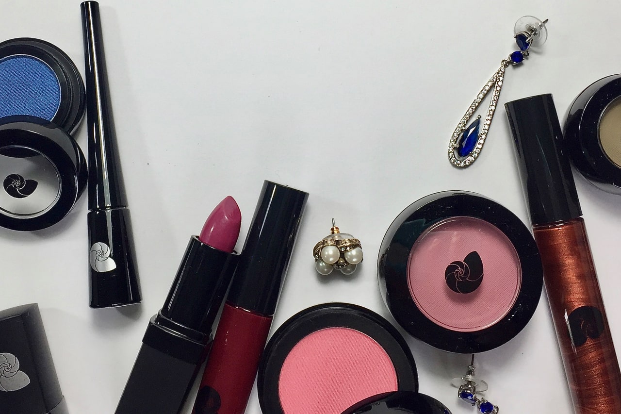
I may have mentioned, you don’t have to figure any of this out. That would be re-inventing a wheel that already works like a dream. The question you may want to address is which cosmetics you’d like to wear and try a few from a pre-selected menu. Or try them all and then decide which you’d like to wear, the program I favour to get around our predictions based on previous experiences. This is a new experience.
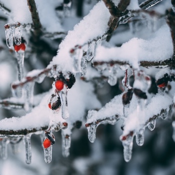 Colour is subtracted from winter landscapes. Light is pulled inwards, whereas colour is reflected light. The skin is the even blanket. The eye colour is surrounded in ice, steel, and coal. So far, the only colour activity is in the eyes. Suddenly, the flush of blood in cheeks and lips feels pure on a still and quiet energy.
However lyrical this may sound, you know that the colour palette has done the thinking so you don’t have to. Within your Season, you’re wearing your flesh tones, just like everyone else.
Would this story improve if we added a buttercup or a bluejay?
 Drama implies extremes, in colour as in character. By character, I don’t mean hysterics and fainting spells. Perhaps a vein of intensity or aggression is mined at times, with more fragility than one might expect at other times.
Extremes are at home in Winter cosmetic application and, as with everything else, built into the colour palette. Drama just happens appears when eyeliner is dark enough. On Winters, it looks ordinary and extraordinary at the same time. You can read more about the rare and precious magic of looking normal in a previous post.
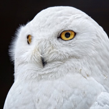
Would the image of the owl make sense with gentle eye colour? It would be weird and off-balance. Gentle eye makeup would be the same, left behind, incapable of meeting the natural colours.
Dark Winter is the Season name for a group of colours that are mostly Winter, with a smaller amount of Autumn. The mixed contribution from warm and cool Seasons places it among the 8 Neutral Seasons.
 The natural reflectivity of Dark Winter skin might be similar to vinyl. Floor tiles or a phonograph record are smooth and barely textured, not mirrors. Too shiny would look oily. Both are hard, but not diamond. Autumn in the mix gives the shine a dullness and the colour, an opacity.
Perhaps also a car. Metallic like Autumn, but smoother and harder. Industrial, tough, shiny, smooth, waterproof, and useful. Good Dark Winter words. Good words for their jewelry and belts too. Dark Winter takes Dark Autumn’s Rustic Opulent and brings in Gladiator. Ninja Pragmatic? I think that’s just me.
A sweater in black or dark grey metallic looks like chain mail. Stud, armour, and link effects are a natural fit here. Keep in mind that our colours and our lines are not the same. Metallic sweaters come in thousands of styles. To choose yours, have a style or line analysis, a service offered by several Chrysalis colour analysts.
Soft or skin-tone lips on Winter feel a bit washed out. Smoked berry reds look alive and belonging on Dark Winter, balancing the eyes and somehow more natural than no lips. Choose a formulation as sheer or opaque as you prefer. Dark muted fuchsia gloss is so easy and so good, a subliminal jewel effect for the mouth.
Darkness works. Smoke is natural, the Autumn muting in the skin. Smoked eyes make sense. Any Season can do smoked eyes with their colours, but it’s most at home on the Darks. Even the other two Winters are best to exercise caution with darkness and smoke to avoid eye makeup looking heavy. They look better in sharp and silvery.
Like a porcelain sink. Impenetrable, tough, and enduring.
Clean. Picture the makeup colours from your palette painted directly on that white sink. Clear-cut eyes, spare with the colours, alongside red-violet cheeks, red-violet lips. No ribbons, no frills.
Not smoked (Dark Winter) or sweet (Bright Winter). Can you tell this before the person is draped, by looking at them? Absolutely not.
 Eyeliner is dark. Eyeshadow is quite light and silvered, depending on the anatomy of the eye. Contour is fairly dark. The highlight is near white or some icy (near white) colour. A little frost effect in the highlight works, whereas a fully matte white or near-white highlight is excellent for Dark Winter, sheer enough for skin to show through and warm the white just right.
On the softer and lighter Seasons, the liner, lid, and contour are closer in darkness levels. They distinguish their roles through different colours in similar darkness levels. Winter’s eye makeup colours, on the other hand, distinguish their roles by using one colour (gray) in a wide span of darkness levels. With Winter colouring, light means really light and dark means really dark.
To say so much with so little is the power of Winter. You are it already. “So be it”, as P. said.
Most True Winters are a natural fit for blush and lipstick in the red-fuchsia spectrum. Red lips (and pitch black eyeliner), certainly work for some women, while others find these dramatic, especially with the intensity that cosmetic pigments can reach. Red is alleviated in Dark Winter with smoke (burnt rose or mulberry red) and in Bright Winter with sweetness (strawberry or coral red). True Winter does the same by using violet, meaning clear purpled pinks, from icy to dark, from sheer to opaque. Icy colour means very light or close to white; the product could be matte or shiny.
In cosmetics, some True Winters wear red better than fuchsia, or both equally well. Try both with your colour analyst. While there is no common denominator feature, strong yellow or olive tones in the surface skin tones may be a clue. In apparel and accessories, all Winters wear their reds exceptionally well, better than anyone saw coming, including them.
The unique blend of innocent light with the brittle sharpness of crystal.
Spring has a hand in Bright Winter. Therefore, we need a sugar coating, shiny, fun, and ornamental. Pink or icy violet frosting spritzed on lids, cheeks, and lips, somehow transforms an outer space effect to perfectly reasonable, the fairy tale and the normal at once.
In the spirit of play, more colours together look like the sparkles in the tailwind of a magic wand. Theatrical effects (cat eye, a few false lashes, fine winged brows, candy lips) are often at home.
If this doesn’t sound right to you, don’t cancel Bright Winter just yet. To reiterate because it will change your life, have a line or style analysis first. You can paint ten thousand faces from the same group of pigments, not a single one with cat eyes.
Definitely a lighter overall palette than the other Winters, still with the same extremes of light to dark that all Winters share.
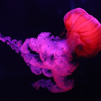 The skin’s reflectivity had me searching for an analogy. Fine china, with that near-transparent edge? Bit too delicate but close.
Thinking, thinking,…mostly Winter, therefore even, smooth and thick, with transparency in the outermost layer… got it. You’re going to love this.
Jellyfish! Stay with me here.
Heavenly and magical come with a price, which is danger.
Silicone skin. Others pay thousands, even millions. You were born with it. Elevate that which you are with intensely coloured products in pigments so pure, you can almost see through them. Transparency is a phenomenon of Spring.
If you’re up for a little theatre, brush powders with a touch of finest shimmer on all exposed skin for an overall crystalline effect.
 A little iced gold uplighting? Sure.
Iced pinky peach, always good on Brights.
Bronzer? No. We feel no bronzer here and nor do we wish for any.