The #1 deciding factor for our most flattering gold, and everything else that participates in appearance, is natural colouring, or Season. Stay in tune with your symphony.
Colour precedes style to my eyes. Even the most impeccably cut suit looks average if its colour is average relative to our colours. Styling that is 50-50 for our body type is improved a lot if the colour is glorious relative to our colours.
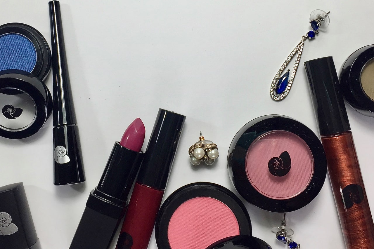
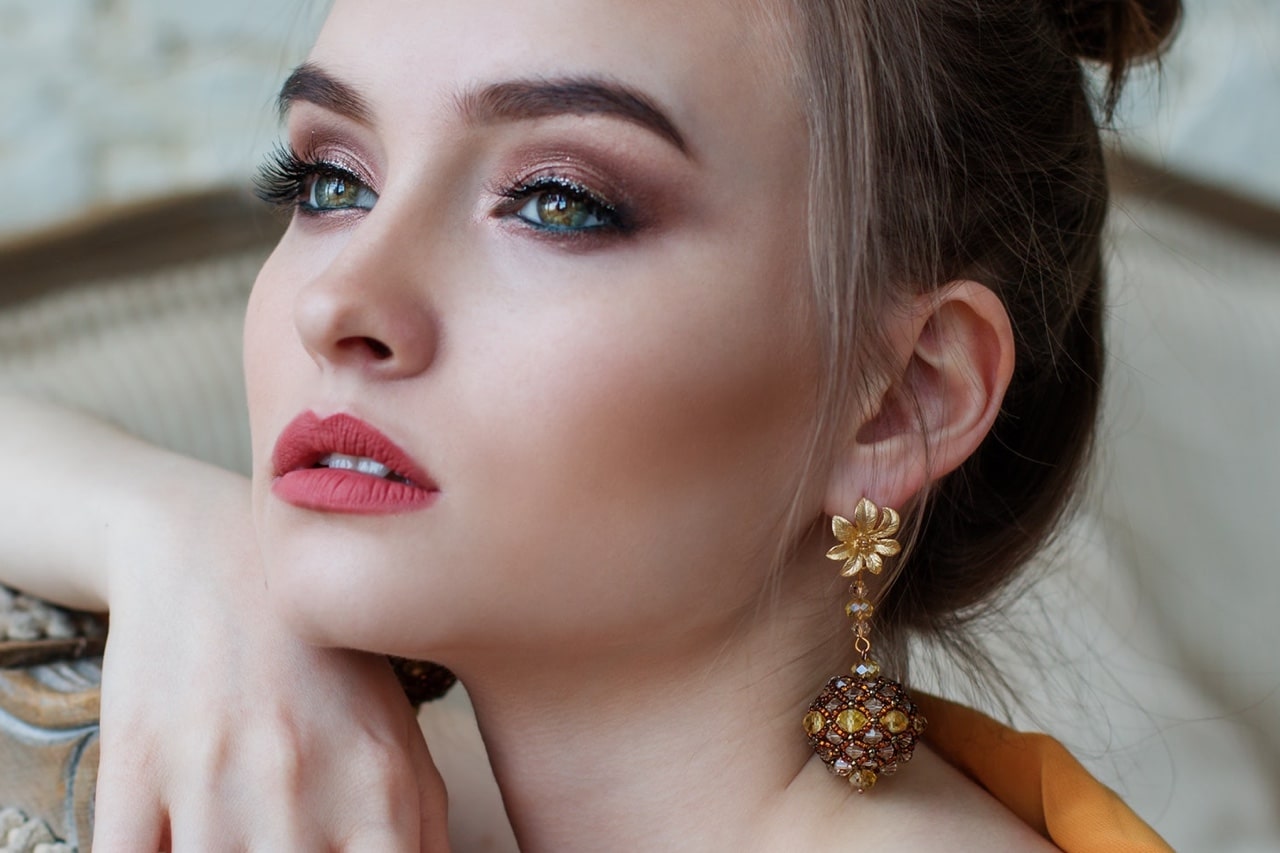
Jewelry, like clothing, have in common that the item is worn above or adjacent to skin. Technically, makeup is too, but at its best, it appears to be part of the skin and a little extra experimenting goes a long way.
Looking around, we may have seen appearances in which apparel, makeup, and hair colour look so fluent with the skin and one another that they naturally belong together. Every colour makes every other colour look even better.
 Looking around, we have also seen gold jewelry next to skin where the skin looks flushed and pink while the jewelry appears darker or duller than it is. Compare a few hands wearing wedding bands and you’ll see examples of more and less attractive combinations. We have seen gold that is too yellow for the skin and seems thin or tin, like a toy, when one person wears it and the height of luxury on another person.
An exercise: with folks you see or meet, try looking at their hair colour and their skin at the same time. Or their jacket with the skin of the neck and face. Observe two areas at once, not more. How do they feel? Is it comfortable to look at both or is it an effort, and easier to take in one at a time?
Personal colour analysis (PCA) offers the solution to an entire appearance in which every colour pair is superb. The math has been done and it works.
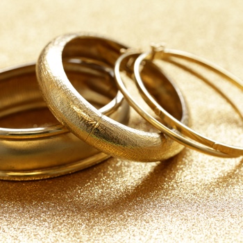
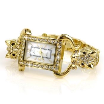
When the gold of jewelry has continuity with the yellows in our colouring, the piece can look entirely belonging and beautiful in its own right, as if it grew from the same soil, like a flower.
If the gold is incompatible with our natural yellows, the piece may look inexpensive or in need of polishing.
If our jewelry is brighter than we are, we look duller by comparison, as if we’re the item in need of polishing. What humans see is relative.
 We have seen jewelry so bling that it wears the woman, and not because it’s too big. The piece may be too shiny. It is expected for jewelry to draw more attention to itself than cosmetics, but not to the point where it interferes with another person’s ability to see us or know us. We are not our necklaces or our hair; if we were reduced to one piece of art, we are our eyes.
When the item is laid on the palette and the choice would not flatter the person, the metal appears dulled, almost tarnished, and the gleam in the stones drops back.
Some Seasons wear satin or shiny surfaces equally well, such as True Spring and True Autumn. Of course, this is a subjective opinion, not a fact. In matters of taste, there are no facts, only opinions. Yours matters most.
The smoother the shine, the sharper the highlight, a look that may settle best with Seasons having a wide white to black range, meaning the Winters.
Other types of colouring wear textured, hammered, or brushed surfaces and look like a gold mine.
Regarding both shine and colour, jewelry can most always be worn well by two to four Seasons, with the metal sparkly and the stones lustrous. Awareness is the first step in becoming sensitized to how colour and texture behave together.
You can find information about metals for your Season in the book, Return to Your Natural Colours, or the e-books for the Season chapters.
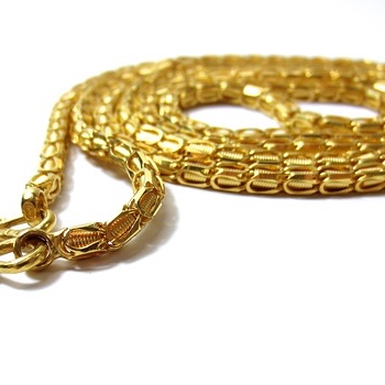 Thank you to the reader who recently taught me that norms in karat of gold differ in various countries. Western and European countries tend to refer to 18 karat or lower. Eastern countries may consider 22 to 24 karat as the yardstick. (Pure gold is 24 karat.)
Colour analysis clients may be confused by general recommendations to wear gold, since the colour may be different depending on where the colour analyst is located. Given the diversity in any population, colour dictated by custom or tradition may be suited to some occasions, while a better choice may exist for others.
Every choice comes back to the Season of the wearer. 22K is probably a fine gold for an Autumn, as the higher karat gives a richer deeper colour. With the many alloys and platings of gold, ultimately, the decision comes down to the particular item. Autumn and Spring have good flexibility with gold because they are naturally warm in colouring and adapt yellow with ease.
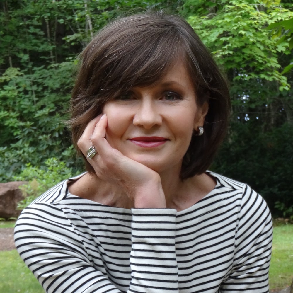
A Q we hear often: Should a person with silver hair wear gold jewelry to compliment skin or a cooler metal to go with hair?
I would choose the metal that goes with the skin.
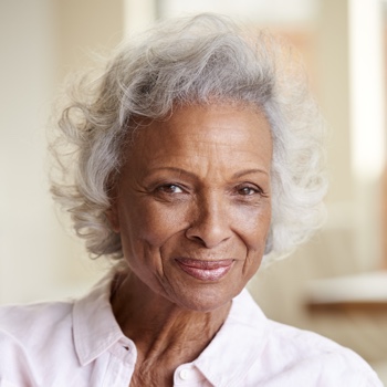 Hair automatically goes with skin, at every life stage, in every person. There are many variations on silver hair, each one tuned to the same frequency as the skin from which it grows.
Warmer Seasons have warmer silvers. I have never seen a True Spring with the silver hair of a Summer or Winter, and nor have I seen a Dark Autumn with the same silver as a Soft Autumn.
For many people, colouring may fade slightly with age, although Season tends to remain the same. In theory, jewelry that is highly pigmented or very shiny for the Season might be expected to seem apart from the mature wearer. In practice, human energy acquires power over time. In the same way that mature faces often wear more and brighter lipstick better than neutral or lighter choices, so do they wear more significant jewelry extremely well. After 50, we may practice the balance between good judgment and being too conservative, and arrive at our own comfort level.
The other change that occurs with age is that hair colour moves from a colour to a neutral. If we think of our hair as just another colour element in overall appearance, when one colour switches to neutral, adding colour somewhere else maintains the vitality. We see neutrals and they matter a lot but as humans, our eyes tend to notice the flowers. This said, I find silver hair in a terrific style to be striking, easily as impacting as coloured hair, if not more so. During these years, moving towards colour in apparel may be the most beautiful decision of all.