by Christine Scaman (Prince Edward Island, Canada)
A colour will always have a relationship to its surrounding colours… whether that be a harmonious one or a disharmonious one.
Let’s say that you just signed the lease on a new office space.
You were looking for the supportive feeling of a home to introduce yourself and your work the minute clients walk through the door. Even in morning sun, the glow of the light cherry wood flooring sold it.
Now to paint the walls and buy the chairs…
One does not generally head to the furniture store and pick colours they like without considering what colours are already in that space (flooring, wall colours and any fixed elements like a stone fireplace or cabinetry).
Nobody would want to create a space where the colours didn’t go together. It’s difficult to live with or feel relaxed or productive. A visitor’s eyes wouldn’t know where to look first, or would float around with nowhere to land.
Imagine hanging rust curtains on cotton candy walls. Who would ignore the wall colour when they choose the curtains? In the same way, think of hair and eyes as a colour block. Rust blush on cotton candy skin or cotton candy blush under rust eyes. The end result is a weird energy clash.
Would you pair your eye colour and your blouse colour together in a print? Because we always wear our eye colour.
As humans, we see one another very, very well. I think humans see better than they hear, and possibly better than they think 🙂 We have no mechanism for denying what our eyes take in.
To decorate that office, the best effect would be to assemble the wall and floor colours, plus logo and website colours, and aim for a picture where all the parts look perfect together.
Bringing together the parts of an outfit is the same. And yet, we see many examples of disharmony around us. Could it be because…
We don’t like the idea of rules.
On the surface, following our colour formula may sound confining. Go a little deeper and the results are liberating. Releasing the barge of colour ideas and purchases that were never ours and do us no favours feels like an anchor breaking free.
Keep in mind that it’s not just the 65 colours on the colour fan or else. It’s these 65 plus 10,000 more and we’ll show you how to figure them out. When you have the 65 as a guideline, you have the key that unlocks all the others.
We never thought of our appearance being the same as decorating a room.
The goal (or my goal) is not looking high class. It is clear communication of who you are as a person and in your career. Who hasn’t looked at a gallery of pictures and scanned through, no, no, no, no, oh hey, this person looks nice, I could work with them. Dialing number. There is an unspoken visual connection that isn’t superficial, it’s just honest.
Presenting a harmonious appearance is the visual equivalent of acting like yourself, not who everyone and their dog says you should be.
Feel the pressure to adapt to every voice gently evaporating, drifting away from you with the next breeze, and never coming back.
We didn’t know there was a method we could use.
If the person exists who can pick more than 6 outstanding colours for themselves, I have never met them. Expecting yourself to be that one in a million person is an unrealistic standard of the sort that never serves us well.
Most folks, like my pre-PCA self, couldn’t choose one. Not a single one.
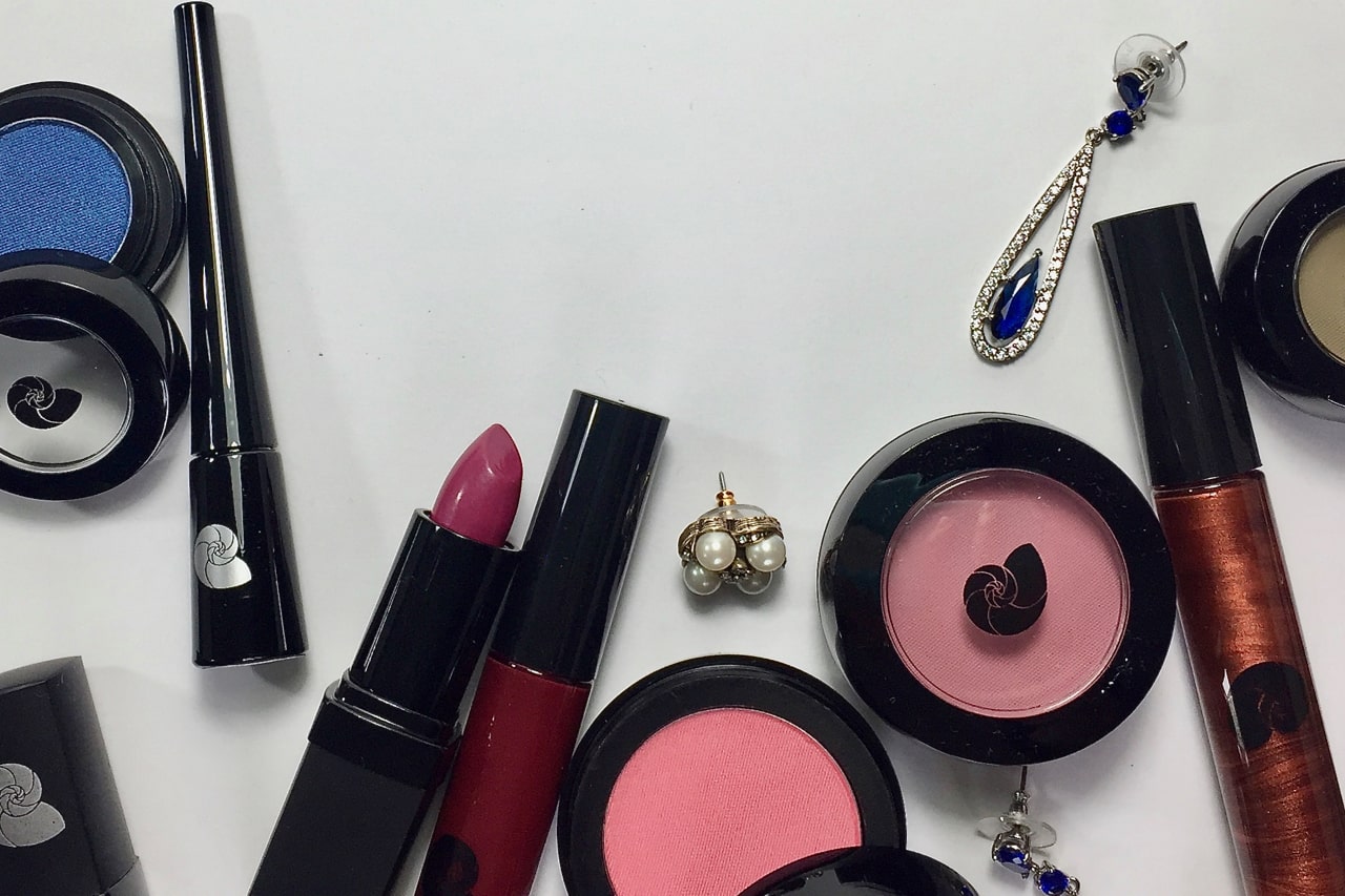
If you laid out your clothes, jewelry, and makeup on your bed or pinned them to your wall, would every colour go with every other? Or would the effect be jumpy, uneven, or distracting, like a house with different shutters on every window?
When colour is brighter than we are, the viewer’s eye goes there and doesn’t go any further. It’s too hard to pull away. When the meeting is over, they never got to know us.
We can teach you how to choose colours that help one another look better and have you speaking one harmonious colour language, instead of five at the same time.
We didn’t realize how big the gap was between where we are now and where we could be.
It’s big. You might look pretty good and have some great lipsticks but you are missing an overarching system to unite every purchase. Our closets can give meaning to our appearance in the same way that stories do, by sharing elements throughout and adding delicious details.
I describe the colour analysis process as a series of comparisons to a calibrated standard. Sounds a bit dry, unless you’re a colour analyst, current or aspiring, in which case, it feels thrilling. As a person choosing attire, you don’t need to know this, but here’s the reason for it and it all comes back to comparisons, because that’s how humans see.
Could be the comparison system that knows your Season in the first place.
X=2Y is a function, a way of describing a relationship that is accurate for any input. Solve for X The Unknown (your colours) by using a known standard (Y, the Test colours). During the analysis, you’ll watch the analyst keep plugging in different Ys till she solves for X.
How will she know that she’s found X and the relationship is right? She’s been trained to recognize how harmony presents itself on an individual.
The comparison could be the relationships that take shape on their own within a colour harmonized wardrobe. Like elves working for you in the night, you will be amazed at how many fantastic outfits come together. You’ll wish you had more than one body to wear all the gorgeous possibilities.
The comparison you’ll find with a Chrysalis colour analysis is between You Right Now and You Who Could Be.
Like any function, the output can be beautiful. That’s math for you. If you want a visual representation of a good-looking function, look up “spherical harmonics” in Google images.
A certain input has a certain output. You wearing harmonious colour looks amazing.
Who knew math could be so pretty?
When it comes to determining your colour harmony, math is drop-dead freaking gorgeous.
We forgot that high fashion is not the same thing as our daily Get Dressed decisions.
High fashion is to daily dressing what museum paintings are to the walls in your house.
At Chrysalis Colour, we start with a given:
You are gorgeous just the way you are. Your colours could not be any better than they are right now. Let’s add more of what you already are.
Your colours are the foundation that we build upon. They are perfect for you, that is the truth. And because we are individuals – there will be many variations on Perfect. This is the power of Nature, and we accept it with awe.
Learning and wearing your colours is like discovering a bank account you didn’t know you had. One day, you realize that you have this huge asset. What you do with it is yours to choose. Of course, doing nothing is always an option 🙂