Hue distinguishes one color family from another: red from blue, green from yellow, purple from orange. We often use “color” as shorthand for “hue” but they are two different things.
Every color has its own formula of hue, value, and chroma. The only exceptions in the Munsell system are the neutral black, white, and grey. These have neither hue nor chroma, only value, which we’ll get to in a minute.
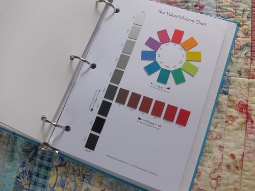 Munsell’s hues consist of red, yellow-red (orange), yellow, green-yellow, green, blue-green, blue, purple-blue, purple, and red-purple. They come full circle, and are based on visual perception (not color mixing, as in paint or dye). Every color in the world will fall somewhere on the hue circle, but there are two other dimensions at play.
Value is how dark or light a color is, with a lower value pertaining to darker colors and a higher value pertaining to lighter colors. This dimension also refers to how much light reflects off a colored surface and how the light is reflected off that colored surface. Glossy colors, for example, reach lower values than matte colors do, but reflected light can obscure the color. Ever tried to look at a magazine advertisement in the sunlight?
Chroma refers to how intense or greyed a color is. Neon colors have extremely high chroma, whereas dusty colors have extremely low chroma. The larger a color’s surface area is, the higher the chroma will be, which is why it’s always suggested to test paint colors in a 2-foot square, rather than making decisions based on paint swatches. A yellow that looks soft and buttery on the swatch can quickly turn egg yolk yellow when applied to an entire room.
Very simply. While each season has its own sweet spot of H-V-C, one of these dimensions will be the most important. For the True Seasons, it’s either warmth (for True Spring and True Autumn) or coolness (for True Summer and True Winter). Our eyes perceive colors with a red or yellow content as warm, and colors with a blue content as cool. The True Warm Seasons have visibly yellowed greys, orange-y reds, and blues with red-purple undertones. The True cool seasons have reds, pinks, and purples with a strong blue presence.
 For the Light and Dark Seasons, the most important dimension is value. Light Spring and Light Summer have the highest (lightest) overall value in the range of palettes. While there are dark colors in the Light Seasons, they are only dark within the confines of the palette. Toss one of Light Summer’s dark colors into one of the Dark Seasons and it will look light.
Dark Autumn and Dark Winter have the lowest (darkest) overall value in the range of palettes. That deep richness is absolutely integral to the palette as a whole.
For the Soft and Bright Seasons, the most important dimension is chroma. Soft Autumn and Soft Summer have the lowest chroma in the palettes. The colors are dusty, gentle, and soft overall. By contrast, Bright Spring and Winter are vivid, intense, and BRIGHT.
Always remember that the most important dimension is still just one part of the formula. For example, Soft Summer is cool-neutral in hue, medium in value, and low in chroma. Chroma alone doesn’t tell the whole story. True Spring is warm in hue, medium in value, and medium-high in chroma. Hue alone doesn’t tell the whole story. Dark Winter is cool-neutral in hue, low in value, and medium in chroma. Value alone doesn’t tell the whole story.
One of my favorite things about the 12 tone system is that the palettes are mutually exclusive. Throw a Light Summer color into the True Summer palette and even though the individual colors might look close, it won’t work. Your eyes won’t rest. I actually run into this a lot when pinning images to my seasonal Pinterest boards. I pinned a beautiful photo the other day of a woman in an olive green dress holding a violin. I put it in Dark Autumn first, but it looked off. I moved it to Soft Autumn and left it there for about a day. The next time I looked, it still wasn’t right. I moved it to True Autumn and it settled in comfortably, like an old friend.