People are constantly asking me if they’re wearing a ‘good’ color. and honestly, if I haven’t draped you, I don’t know.
I mean, I can usually tell when someone is wearing a color quite different from their season, even if I haven’t draped them, but as far as what’s best for them? I need to drape you to find out!
Color analysis is a whole lot more objective than you may think. I am not telling my clients what colors I like, neither am I using some method of combining hair/skin/eye color. Rather, I am showing everyone who sits in my awesome chair what different colors will do to their skin.
Let me explain this better using some photos.
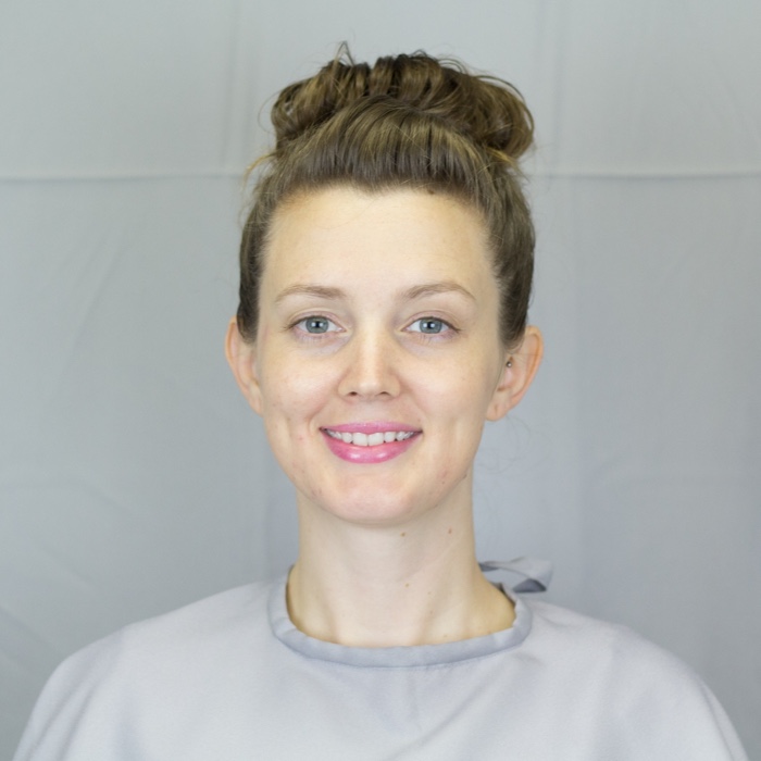
Whenever someone comes in for an appointment, I of course want to make sure the draping is as accurate as possible. One way I do this is by using a neutral environment. I want to eliminate as much “color influence” as possible, which will ensure the reactions we observe on the face are only caused by the color we are testing. I also use full-spectrum softbox lighting, which is as close to natural daylight I can get inside my studio.
Now, you have most likely seen something like this in your life at some point:
The green squares are exactly the same color, but they don’t look like it because of the different colors surrounding them. This is called simultaneous contrast, and the same effect happens on your face when it’s surrounded by different colors. This is why covering up any clothing, hair dye, and wall paint is crucial during an analysis. We don’t want to be distracted by any other colors while we observe your face.
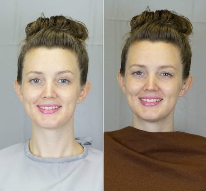
This is Brittany. She’s obviously lovely here in this neutral gray. Her hair is not colored, so I have left it uncovered for this demonstration. She’s graciously allowed us to see the differences that happen on her face when we try some drapes.
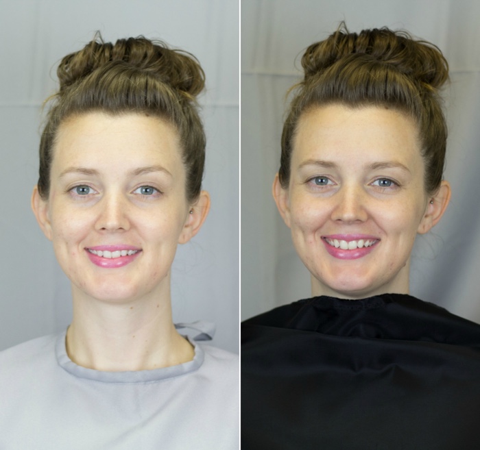
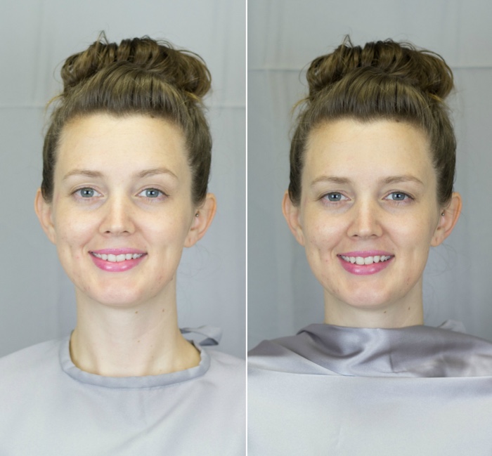
When we put Brittany in a True Winter drape, we get the following effect.
We’re seeing a lot of shadowing under her eyes and around her mouth. See how she’s got a bit of a dark shadow creeping up under her chin as well? This is telling us that this drape is too dark. She’s also a bit visually “behind” the drape, which means she appears to be farther away from the camera than she really is. This happens when a color is too bold or bright.
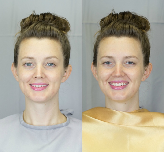
Let’s try another drape. How about True Spring?
Here, we get a different effect. Her skin is hard to distinguish from the drape itself, and her whole face takes on a sort of golden, “self-tanner” effect. Her hair appears warmer, and the whites of her eyes are less clear. This drape, therefore, is too warm for her. Like in Winter, her face is being overpowered by the brightness as well.
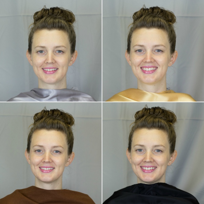
Okay, so what happens if we choose something more muted, like True Autumn?
There’s that chin shadow again. It’s less obvious than the Winter drape, but the darkness in this brown drape is deepening the naturally occurring lines around her mouth and under her eyes. Her skin appears much yellower than it really is, and she’s even got a bit of a bluish tinge under her eyes, which is virtually nonexistent in the neutral photo. It appears that Autumn is too warm and too dark for her.
How about True Summer?
Now we’re getting somewhere. Her skin tone is even, and her teeth and eyes are bright and clear. Her cheekbones, dimples, and nose are well-defined without appearing sunken or heavily shadowed. Of the four drapes we’ve seen so far, this is certainly the best one.
One girl, four faces.
Crazy, huh?
One girl, four faces. Crazy, huh?
But can we make it even better?
First of all, let me be perfectly clear. Brittany is beautiful. She does not look bad in any of the photos on this page. Again, I am simply pointing out the changes that occur in her face when she wears the different drapes.
True Summer might have been the most flattering drape so far, but we’ve only seen four of the twelve seasons. If this were a real draping, we would begin looking at full color sets and compare many different reds, blues, greens, yellows, and neutral colors. That would be a lot of photos, and this post is already pretty long. (P.S. if you’ve made it this far, yay!)
Brittany is a Light Summer. This means she is a Cool-Neutral Season in the Summer family, with influence from Spring’s warmth. Light Summer gives her a hint of fresh clarity without overpowering her. You can see her neutral photo and the Light Summer photo make her look pretty much the same – that’s good! We want to see her as she truly is, and Light Summer is clearly the best season for us to do that.
I mean, come on, that’s one lovely lady. We don’t need to change a thing about that flawless face.
The truth is, I can’t tell what season someone belongs to just by looking at them.
After seeing so many people, I usually have a reasonable guess about what they might be (or might not be), but I would never be comfortable assigning someone a season without draping them. It’s my training as a color analyst, and my top-of-the-line calibrated drapes that allow me to uncover the beauty you already possess.
If you would like to experience what Personal Color Analysis can do for you, contact me for more information.
Alane Rode is located in Wisconsin. In addition to in-person Color Analysis, Alane also offers a Personal Styling service. Please click the link buttons below for more information.