On a recent call, one of my beautiful clients showed a top which I suggested looked a bit too light and soft and hence, might not fit into Dark Winter as presumed. She replied that she had checked it with the fan and here’s what it looked like:
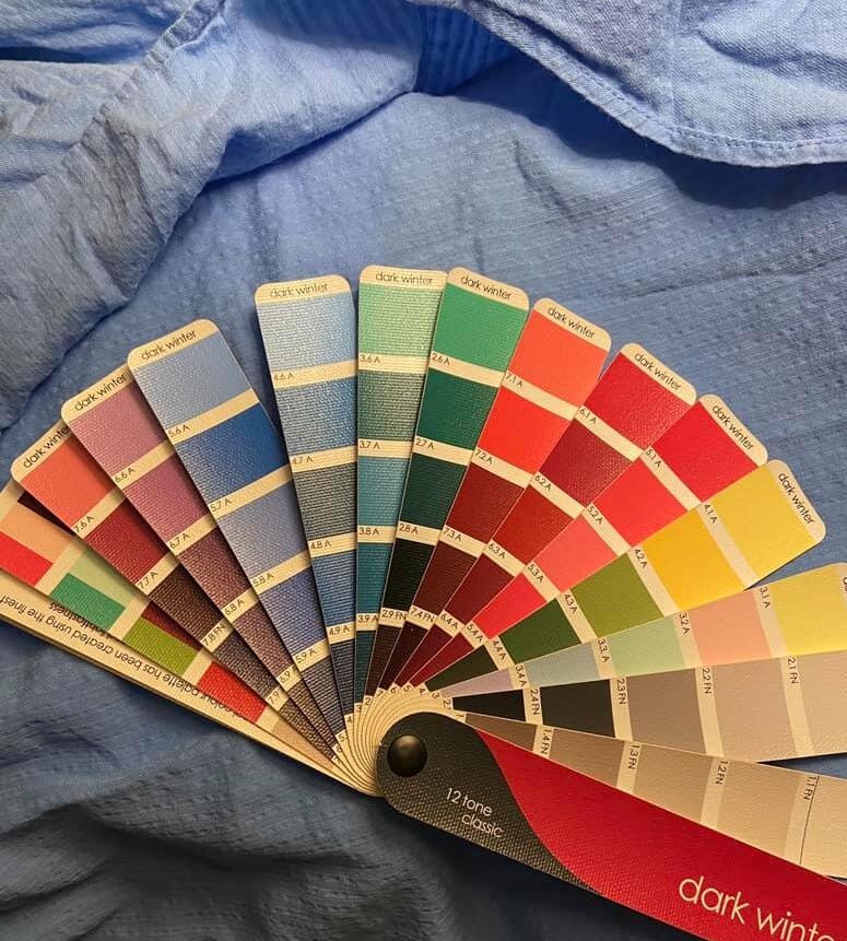
Before you run off and interpret the above as “close enough is good enough”, let me just make it clear that sometimes it is and sometimes it most definitely is not. We’re not good at judging how close a color is to another color, so we’re not going to make decisions based on that at all. Instead, we’re going to seek to identify how the color in question fits with the whole palette. Let’s look at some examples.
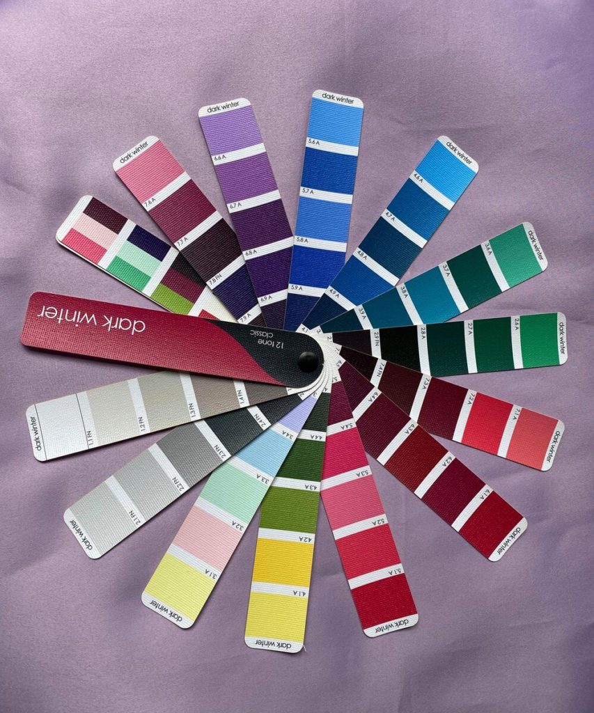
Here, we have a blue drape from my analyst kit in a similar range to the one my client was looking at (obviously it’s darker, but as you’ll see in a moment, it has a very similar relationship to the dark winter fan as the one she was testing). I’m cheating somewhat, as I already know what season this drape is, but more to the point I think most people would look at this image and feel it’s a fan match. For me as well, it’s hard to say whether it is or not if this is all I have to go on. I start to feel frustrated looking at it… my brain wants to shout “I’m not a wizard! How should I know?” Well, yeah, that’s pretty much how it feels to try to analyze color with one hand tied behind your back. So let’s make it WAY easier, shall we?
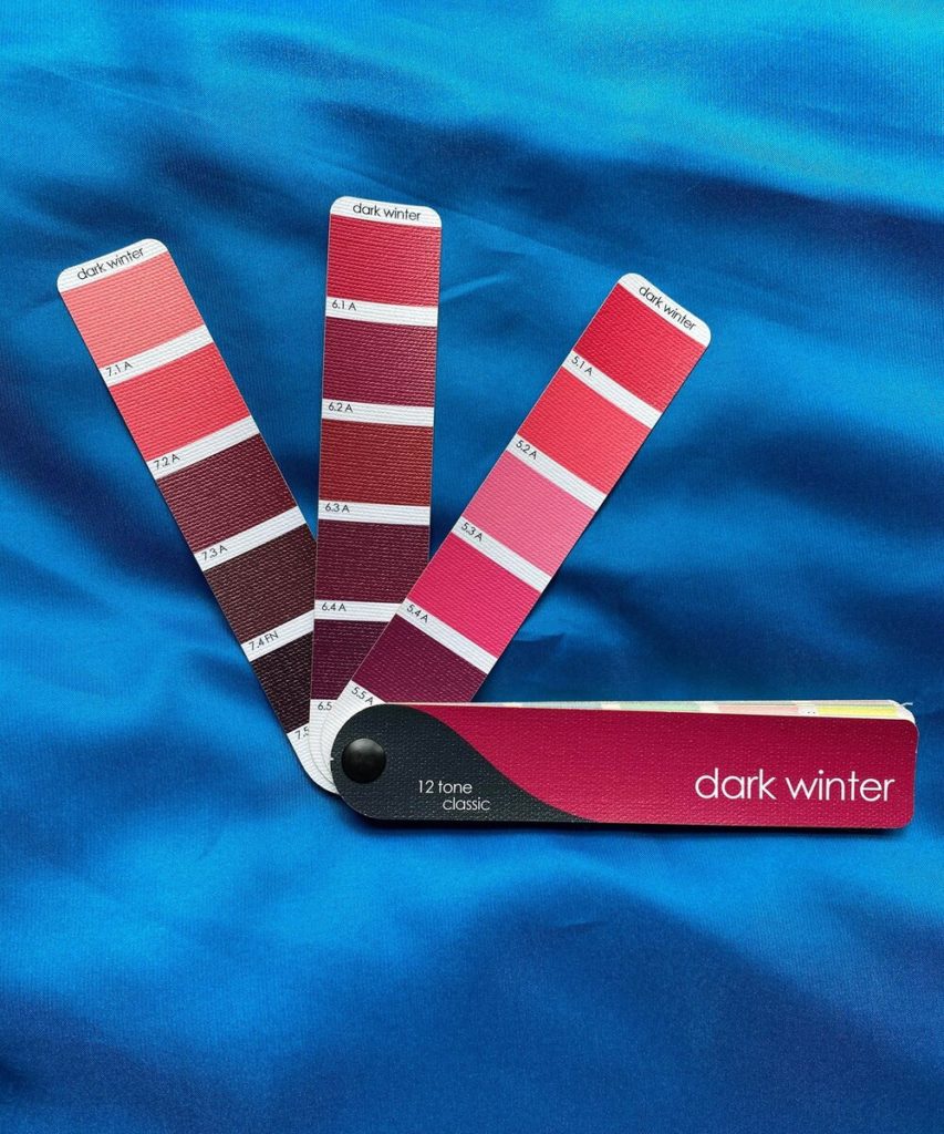
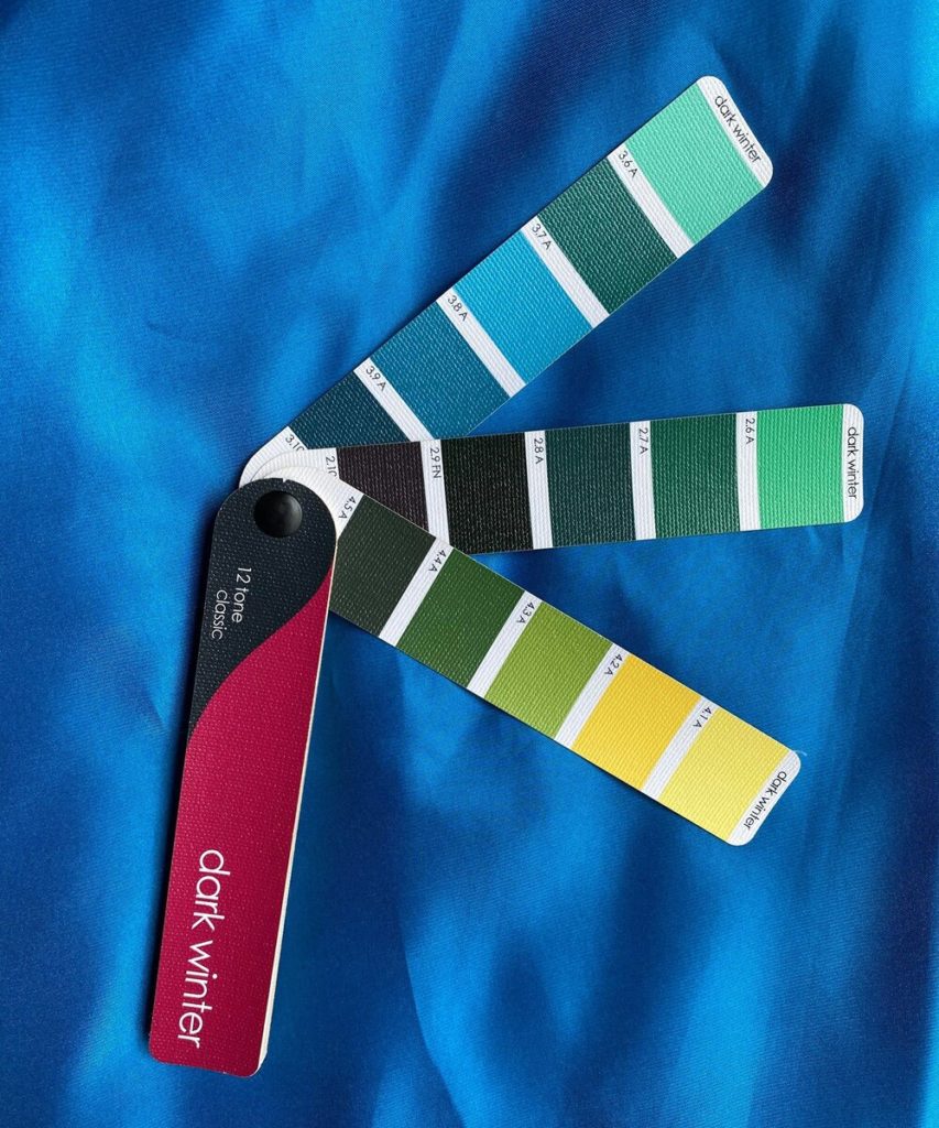
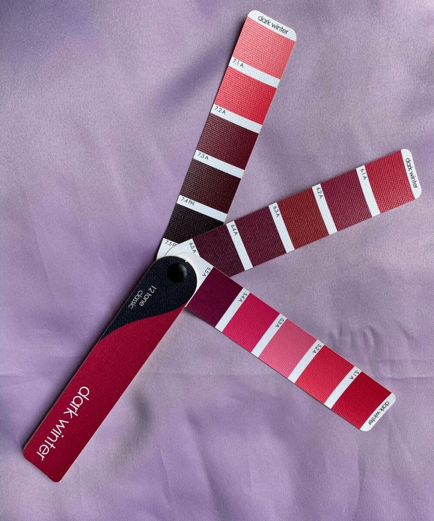
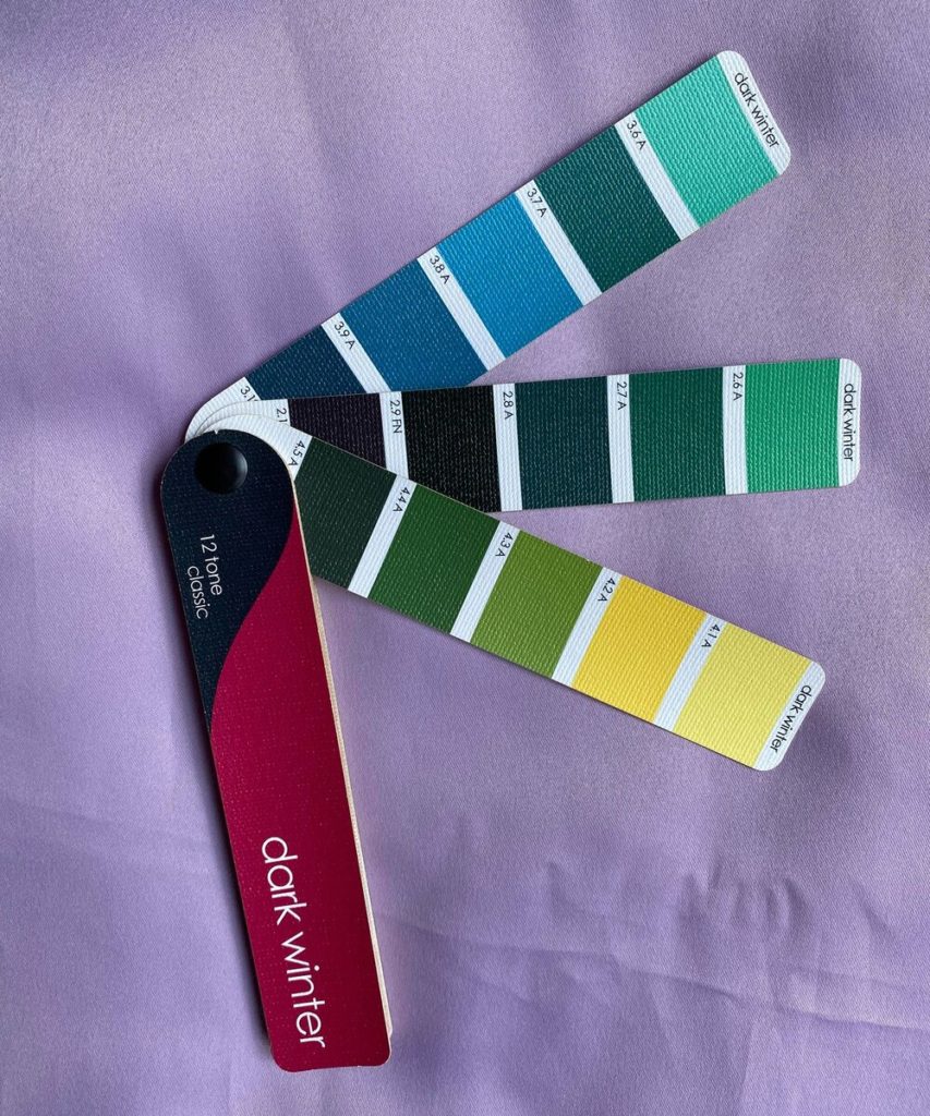
If it’s hard for you to see what I’m describing, don’t give up just yet. While looking at the whole fan at once can be an invaluable tool, it can also be a little TMI – just too much information to take in at once. This is especially true for beginner harmonizers, but sometimes I still find myself overwhelmed. Fortunately, we can break the problem down into smaller bites without reverting to attempts at “matching” by breaking down the fan into smaller chunks. The idea is to look at just a few strips at a time, just NOT the ones that are closest to the item you’re examining. Here is the same fabric the season’s red colors (which I often refer to as “the lipsticks”), as well as the greens, which as my mentor Christine Scaman has said, are usually either great (because they harmonize) or gross (because the wrong green is pretty yuck). I often use just the neutrals or just the strip of color combinations on its own, but really anything that helps to approach the problem in smaller bites can be very helpful.
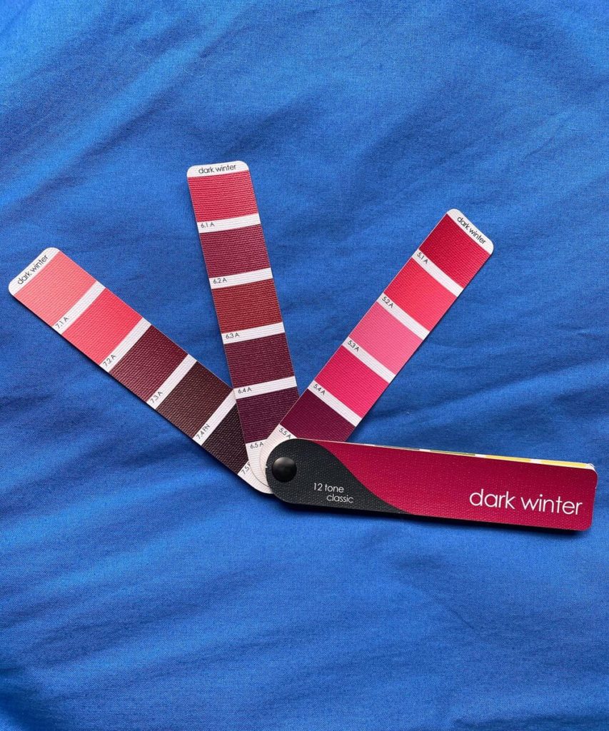
Looking at the lipsticks alone, I can see that almost none of them truly work. The brighter shades are blinding, while the darker shades are too heavy, hard, and dark to be a mouth color next to this top.
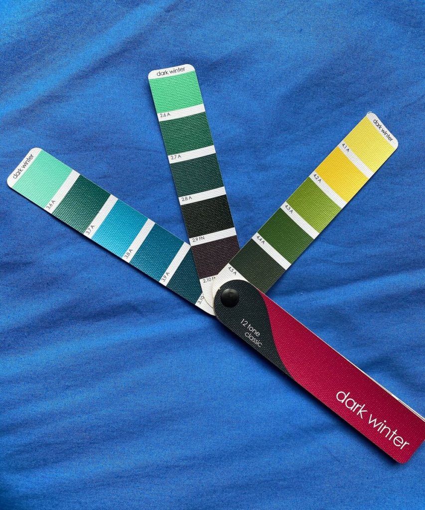
The greens present similar issues – only the coolest, bluest colors here look particularly nice next to this blue. The olivey-yellow greens look nauseating, and even the lightest greens are too sharp next to this blue. If I didn’t already know, I wouldn’t have enough evidence to say what season this fabric is. That’s ok because unlike if I were swatching this fabric to use as a drape in a Color Analysis, here, I only need to know one thing – Is this Dark Winter, or isn’t it? And I do have enough evidence to say it likely isn’t.
To reiterate, this isn’t enough information to know what to do with this item. A wide variety of other factors must be weighed in that decision. It’s best to approach harmonizing as a separate step, something akin to trying a garment on to check the fit or checking the tag to see the fiber content and care instructions. By doing so, you can move into the decision making phase with the most objective, clear information possible.
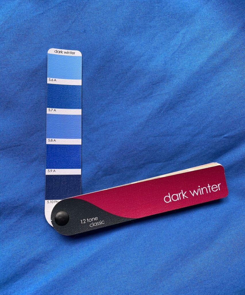
With practice harmonizing many items will be easy and straightforward, finished in seconds upon placing your fan down. Other examples, like the one we’ve been exploring, are not as obvious or straightforward. In case it might still not clear to you why this blue doesn’t fit, let’s look at a couple more examples. Dark Winters often find it a struggle to locate their more medium and light value colors apart from white, but also understand that they need contrast to create the most effective, “in-focus” picture. So here we have a blue of similar value (albeit more greenish) which does fit with the palette.

I don’t know about you, but for me when I look at this picture, the energy is electric. The fan looks balanced with itself, and also with the fabric, and I can see the whole picture at once without it fragmenting. Even the unexpected combinations are beautiful and would be gripping in an unexpected, artistic print together. The deeper, warmer colors look rich but not dirty, the bright colors look vibrant but not glaring, and the neutrals look crisp, clear, and sophisticated. The fabric isn’t an exact match to any swatch, though it resembles some, and it doesn’t need to be. Go back to the image of the previous blue with the fan – can you see the difference?
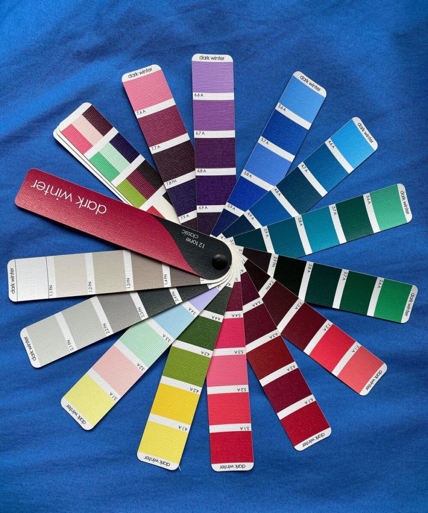
Here’s the same breakdown we did before with smaller chunks of the fan. The lipsticks are balanced, the bright options stay manageable and even the darkest swatch looks intriguing and not heavy or like a black hole. The corals, a decent approximation of a complementary color for this fabric, are heart-stoppingly pretty. If this is the woman, I see her and I see her lips and I’m not distracted, but rather want to know more.
The warm greens that were headed in a bodily fluid direction before are now bringing to mind fresh leaves and stems. The sharpness has disappeared from the light greens and yellows, and I can see them defined but in balance with both the fabric and the other fan colors. In contrast to the pictures of these segments next to the previous blue, I feel resolved looking at these pictures, not confused or questioning. The picture just makes sense so my mind doesn’t have to keep trying to figure it out and can simply relax and enjoy the view.
This blue is both light and bright enough to produce plenty of contrast for a Dark Winter when worn with black (or another dark neutral), but deep and rich enough to also work beautifully well with white (or another light neutral). However, it’s true neither of the blues we’ve harmonized here is as light at the top my client asked about. So here’s one more example, an icy lavender for Dark Winter this time (as I don’t personally own a light blue fabric for this season, though they certainly exist).
Even though this color is light, it holds its own against the fan just as the previous blue did, balancing both the light and dark colors and allowing the fan to come together and form one picture.
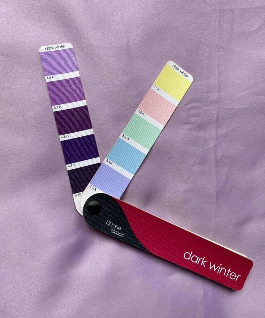
I’ve taken an extra image of this one, to show that colors that harmonize to your palette may not look exactly like anything on your fan. If you were “matching”, you’d never pick this garment, which would be a shame as it’s so incredibly lovely on women of this season. Nevertheless, this drape is beautiful with the other purples that are represented as a swatch. Both expected and unexpected color combinations work. The picture is easy to look at an doesn’t leave me scrambling to make sense of it.
Lastly for consistency’s sake, let’s look at our little fan chunks. Yes, the light shifted slightly as I was photographing this drape, but it’s representative enough to serve the point. This drape performs more similarly next to the fan to the previous blue than to the light blue my client showed me. From this, we can surmise that unlike that fabric, this one is high enough in chroma (aka brightness) and the correct hue (cool-neutral) to maintain harmony with the fan despite being high value (aka light).