
A 100% worthwhile goal if the option is looking off-balance.
What does it mean, to look normal and balanced?
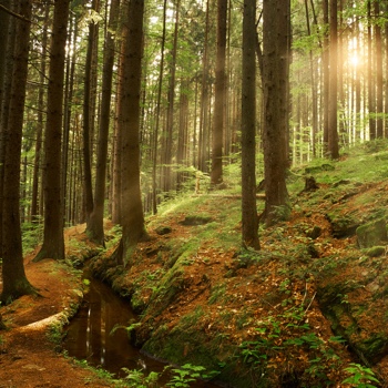 In a natural landscape, the energies are balanced. Our attention is divided fairly equally. We notice flowers more than earth, but without the earth, the whole image would be strange, alien, irrational.
Gladiolas would be odd in a shady forest.
Pyramids would be odd under a Caribbean sun.
As the viewer, we’d know instantly that the feature, the landscape, or both had been processed, one abnormal relative to the other.
Colours that are too foreign to our personal rainbow fall behind our normal or surpass it, as does our presentation when we wear them.
In another person’s appearance, without worrying about the why or how questions that colour analysts are trained to answer, we can compare the person with their attire in a less-than or more-than relationship. Would the clothing need to be dialled up to be in balance with the face or dialled back?
Is there a gap between the person and what they wear, or has the clothing overlapped itself onto the face?
Colour analysts and many of our clients know what it means to say that a colour sometimes goes all the way up to the hairline. We want our face to be slightly in front of the clothing, following the normal position of our face and chin relative to our chest. Picture how it might look when the face, chin, and chest are visually in the same plane. Would you agree that the effect is not normal? And if it’s not normal, what is it? Odd, distorted, hard to make out, maybe weak.
Looking normal could mean looking real.
While we’re into complicated definitions, what does looking ‘real’ mean? Or just ‘real’?
My nearest definition of reality is the approximate average of what everyone else sees or experiences.
Sure, we all see a little differently and have our own preferences. We all taste mushrooms or chocolate a bit differently, but none of us is using them interchangeably in recipes. We tend to agree on which flavour combinations enhance and define one another, which are mediocre, and which are uncomfortable to think about.
So are we with colour. We may enjoy red or find it aggressive, but most of us would prefer poinsettia flower red with poinsettia leaf green rather than, say, the leaves of willow or eucalyptus. Imagine that the flower’s red is the one present in our skin, as well as our eyes and hair, which are like extensions of skin, which green would feel good, balanced, normal, and real alongside it?
The name of the game for wearing great colours every day is knowing the colours in our skin.
Normal allows and accepts what’s there, without need to conceal or hide. Normal was how we looked before we decided that moving away from ourselves was more somehow beautiful.
Buy clothes, wear makeup, and colour your hair, whenever you want, for as long as you like. Do it in alignment with who you are already. We love who you are more than a mask of who you’re not.
I sometimes meet a client who has, over the years, made appearance choices that pull her away from her natural glamour. By now, she can’t be seen for the stuff. She knows something went away. She tells herself it’s weight or silver strands. Her friends can’t help because they don’t know or they say what she wants to hear, or both.
This was me for so many years. I couldn’t be seen for the highlights and too-warm, too-bland makeup. I went through stages as I learned to see myself more clearly. For awhile, you couldn’t get to my eyes for the eye makeup. By then, I knew some colour, image, and line analysts who offered reliable, educated, comparative, and elegant feedback. If you’re reading this site, they’re your new friends too. Expect improvements to come fast.
The saying, “You can never regret saying nothing.” is untrue when we’re talking appearance. We may have seen Nothing so much that it became Normal, until Normal stands up. I promise you that you have a version of Normal that is magnificent in its normality.
Every person has natural glamour and plenty of it. No exceptions. We’re here to help you find yours.
When the colours are brighter or darker than hers, the clothes are wearing the woman. The apparel is more than her normal.
 One Season’s normal is another Season’s beyond. When apparel is beyond, she is hard to see for what she’s wearing. She may try to keep up or compete with her attire using hair colour and cosmetics. In the viewer’s perception, as more and more elements of appearance are getting further from their starting point, she moves further from her normal.
She is too defined, too contrasting, creating an effect that feels forced, a pressure that the viewer feels. We don’t move towards more pressure. Once everything is processed in a way other than her born-this-way-believable look, the picture is complicated. So is the first impression, and sometimes the relationship that follows. It can be hard to get past the political candidate’s eyeliner and commit your vote.
When attire is less than her normal, the clothing loses energy. The effect is tired, faded, weak. If we think of appearance as a 3-block stack, the top block (the head) is too big for those beneath. A variation is blending so much into clothing that we become harder to see, less defined, where the top block (head) and middle block (upper body) fuse into one.
What is her sweet spot? She got her colours done and found out.
It’s the difference between the beautiful dress she wore to the wedding and the one she would have bought on her own.
It’s the relief of being the person we really are and knowing nothing could be better.
Neutral colours may be most important because they’re the backbone of a look. We don’t notice the bark as much as the leaves, but what’s the point of the leaves without the trunk? Picture it. It’s like hair without a head. Sound without silence. A rainbow without a world. They need one another to be appreciated.
Dressing in neutral colours is also popular in many wardrobes. In urban settings and minimalistic closets, for example, wardrobe neutrals may take up most of a closet.
Do your neutral colours support you?
Not whether they provide emotional support, although when we wear our own colours, that’s one of the best things about them. Most folks arrive at this realization a little further along their colour path.
By support, I mean, Do your clothes visually hold up the top block, your head?
It looks smart. By smart, I mean stable, connected, and intelligent. Able to make good decisions.
Because picture an unsupported head, in which the gap between the face and apparel is a step down. Visually, that’s a downhill energy slide from the head to the feet. Would they have enough energy to be our realtor or an employer who would go to bat for us?
Picture the lower blocks as colours too strong. They’re prominent in our awareness. The body just got bigger. The head has to look smaller. Nothing else can happen. Not a look I’d choose for men or women or myself.
Looking around, we quickly see that backbone colours are not created equal. We see many white, gray, taupe, and black variations when we shop. We see people in gray hoodies who look pretty good and others on whom the same colour is lifeless.
Wearing neutral colours is fine if they’re our neutrals. Outfits and combinations look crisp, smart, supported, healthy, and creative. We look normal in the best possible way.
The great thing about normal is discovering that you’re enough.
 After we spend 20 or 40 years adjusting and re-adjusting ourselves, wearing our own colours can be our wakeup call that we don’t need to do that anymore. We never did.
You can trust me on this.
We don’t have to buy into the idea that we need to adding to be glamourous or subtracting to be comfortable.
What’s there is already tremendous and beautiful and right. Add more of it.
Your natural beauty climbs one level higher.
Compounding interest.
What if the benefits of knowing your colours were as good as I say?
Have things ever turned out even better than expected?