by Florentina Mossou (The Netherlands)
Part 3 A Statement of Dimension – Contour for Horizontal Yang
Overview
- Introduction – Light, colour and shape
- A Statement of Scale – Foundation for Vertical Yang
- A Statement of Dimension – Contour for Horizontal Yang
- A Statement of Curve – Blush and Lipstick for Vertical Yin
- A Statement of Detail – Highlighter and Eye Makeup for Horizontal Yin
- Creating Your Signature Makeup Look
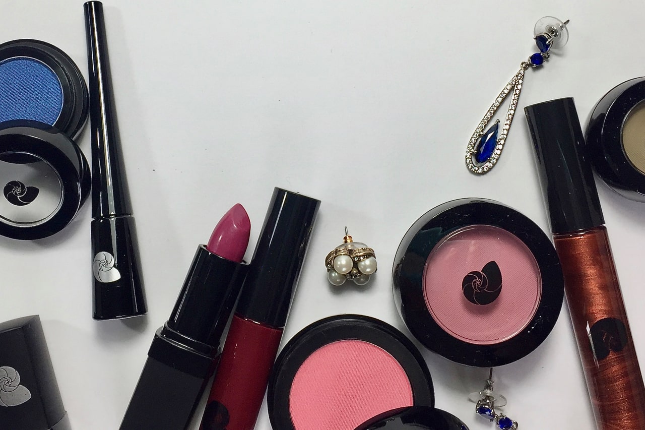
It’s the third post of the Makeup Masterclass! If you didn’t catch the previous parts, you can find them here: part 1 & part 2. In these posts, we considered the four Seasons and four major body type dimensions in Align, and we looked at foundation from the perspective of the vertical yang body type. In this post, we’ll dive into contour, bronzer, blush and highlighter and how they relate to the best skin finish, from the perspective of the body type with horizontal yang. When it comes to makeup, it’s the horizontal yang presence that is most beautiful with a dimensional skin finish.
A Statement of Dimension
Horizontal yang is most effective at drawing attention to her eyes when her bone structure is emphasised. The 3D shape of her face guides the gaze. With the dimensions of her bone structure showing the way, her eyes become magnetic.
[Please not that I use the word ‘dimension’ in two different ways: 1) referring to the four major dimensions of Align, as well as 2) the 3D dimensional structure of the horizontal yang face. The language gets tricky sometimes. ]
How to know if you have a horizontal yang dimension?
If you are medium to tall in height, with strong joints, bone structure and musculature, you are likely to have horizontal yang in your presence. Also, your hands and feet are likely to be somewhat larger than average.
Just like in the previous post, you don’t need to have horizontal yang as your primary influence for this article to be relevant. It can also be your secondary or even tertiary. Again, you may have to scale down, or up, the effects by adapting the amount of product, area, or coverage. Everyone can take ideas from this post and experiment with placement, higher, lower, further outward, inward, bigger, smaller, wider gradients, narrower gradients, blending and density.
Furthermore, what about contour for yin? Yin contouring is an art onto itself, and we’ll have a section on that at the end of this post.
The purpose of contour and bronzer
Before we dive into contour and bronzer for horizontal yang, let’s cover the basics . Contour and bronzer are often used interchangeably, yet they actually have entirely different functions.
Contour
Contour is supposed to emphasise the three-dimensional structure of the face by mimicking shadow. Bronzer is intended to mimic a sun tan. These are fundamentally different things (although we will meet an exception below), and requires different shades.
Contour is a dimension product – it is about shading, literally imitating the natural shadow of the skin tone, to emphasise the 3D bone structure. Shadows do not glitter or glow, so no shimmer or shine is required. Contour, therefore, is the skin tone with the colour of shadow mixed in.
So far so good. But hang on, what colour is shadow?
Shadow is grey, not brown. Grey added to beige will make it look browner, yes, but that is different from adding brown to the skin colour in the first place. Adding grey means we go down in value, and increase darkness. There is no need for terra cotta or chocolate coloured contour, for Caucasian skin. Sticking somewhat closer to your foundation colour is a better idea. Similarly, darker skin tones look totally normal in that same chocolate contour, but wouldn’t wear black for this purpose.
Those familiar with colour theory in art, will know that shadows are not made with grey but with complementary colours. As gradients of complements pass through grey, we will use grey for simplicity in our experiments below. Contour is your skin colour with grey mixed in.
Bronzer
Bronzer on the other hand, is a complexion product (alongside foundation and blush), affecting a different skin surface colour. Specifically, bronzer is localised fake tan.
The origin of a tan is physiological rather than optical. A tan results from more eumelanin, which is either brown or black. Brown is close to black, so for the sake of simplicity, we will use black in our examples. Therefore bronzer is your skin colour with a very small amount of black mixed in.
Mixing in black makes a colour darker, but in small doses the colour actually becomes brighter. That’s because black is not just dark, it’s also very saturated. In very small amounts, the brightness takes precedence over the darkness. The diagram below shows how adding tiny amounts of black brightens a colour.
Tanned skin is marginally brighter in colour. (This may be why we look for brighter lipstick in summer.) Since bronzer is more about colour than shadow, a small amount of reflective shimmer or bronze particles are believable, and will make it seem as if some of the sunlight still lingers there.
More dimensionality: highlighter and blush
Next on the topic of dimensionality and optical effects is highlighter. Highlighter is the colour of your skin under a higher amount of direct light. Light is typically white, so more light reflection means the skin colour becomes mixed with white.
Finally, there’s blush. Like bronzer, this is a surface colour or complexion product. Because blush is a physiological effect rather than an optical one. Sunlight warms the skin, widening blood vessels and flushing the skin with red.
Four products for dimension (1)
To summarise what we’ve learned so far:
- Contour adds grey to the skin colour. This is what we call a ‘tone’ in colour theory.
- Bronzer adds black. This is called a ‘shade’.
- Highlighter adds white. This is called a ‘tint’.
- Blush adds red. This causes a change in hue, so we might say it is a ‘hued’ (or indeed, blushed) version of our original skin colour.
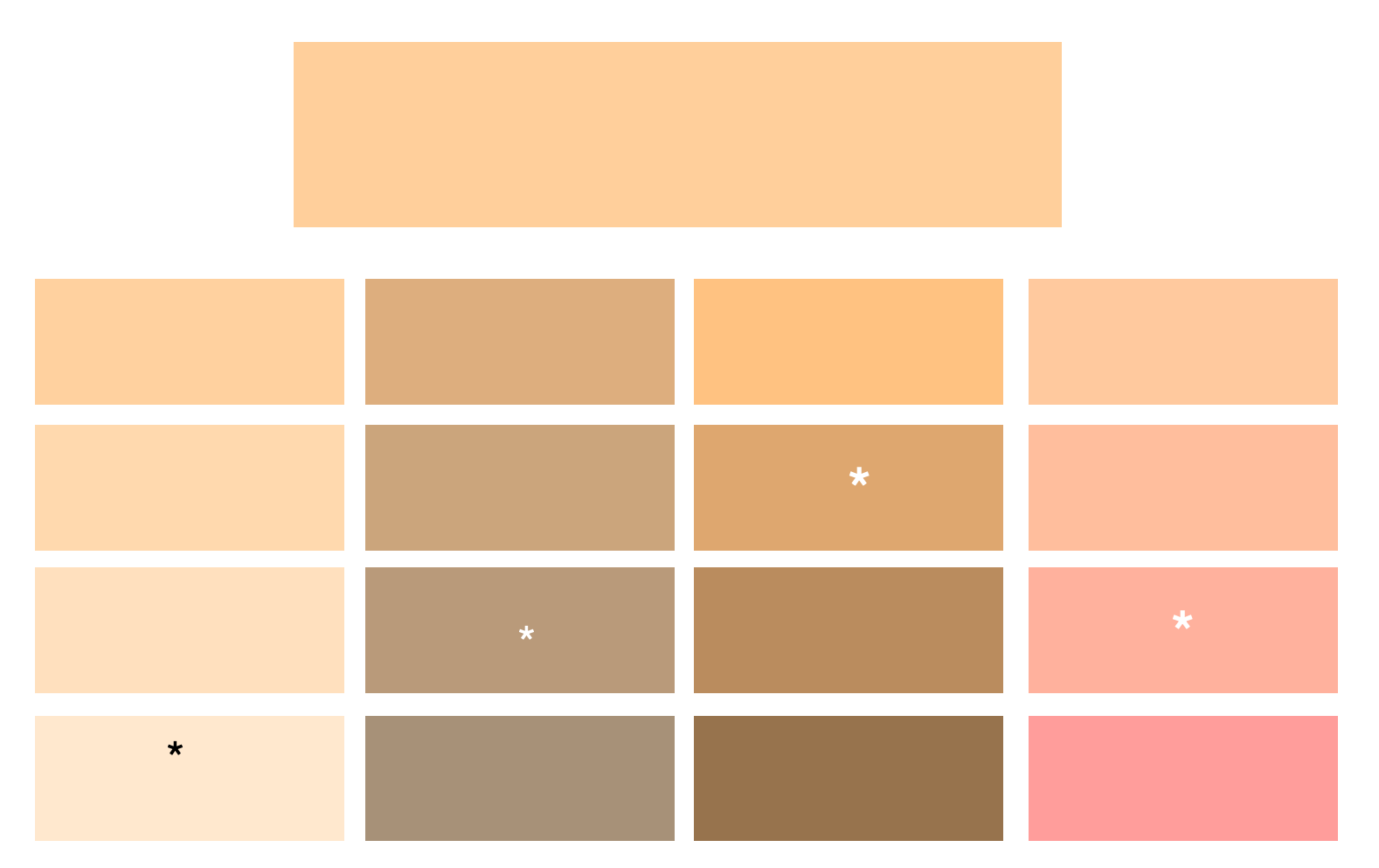
Let’s try that out: an overtone colour experiment
In the grid above, the large box at the top is the closest approximation I could get to my own skin colour. It’s a bit one-dimensional because skin colour is a layering of different colours at the same time, but it serves our purpose for today.
And if you were to say, ‘That looks mighty yellow!’, I would respond with
‘Indeed, you are correct, Dr Watson. That is yellow.’
In the first column, I gradually added white a series of tints, for highlighter. In the second column, the amount of grey is gradually increased, producing a series of tones, for contour. In the third column, a series of shades expands with gradual addition of black, for bronzer. In the fourth column, you see a ‘blushed’ series with gradually more red added to the skin tone.
These colours show up in my skin naturally. The closest match is indicated with a star. As an overtone experiment, these are the colours for my complexion after applying makeup. To get to that rosy colour of blush, I still apply Bright Winter fuchsia.
The best skin finish for horizontal yang
The relationship that horizontal yang has with light, is rooted in its angularity. As a result, some parts of the face are more brightly lit, while others are in shade.
That shadow can be used to emphasise the bone structure and 3D shape of the face. It helps the viewer understand where the face starts and stops, with clean edges and defined planes.
The clarity of the bone structure gives an easy elegance that is comfortable to look at. The viewer is generously supported to look at the eyes, while still remaining aware of the whole face.
Emphasising the bone structure involves wearing contour and bronzer, and to a lesser degree, highlighter and blush. From our experiment above, we now understand what effects we are looking for on the skin colour.
Four products for dimension (2)
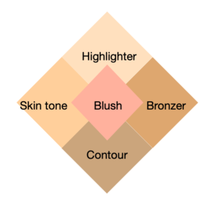
Contour, bronzer, highlighter and blush together looks like this:
- Highlighter is placed on top. Due to the addition of white (‘tint’), it is cooler and paler.
- Bronzer is placed on the outside of the face (right side in diagram). It’s darker, and richer in colour (‘shade’).
- Contour is placed underneath as a shadow, and is subtly darker and cooler (‘tone’).
- The normal skin tone remains visible on the inside, close to the nose(left side in diagram).
- Blush mingles with all the colours in the centre.
These four products give us the full range of skin colours in a 3D face. This is the most magnetic version of horizontal yang makeup to help enhance the eyes.
Now that we know what colours our products should have, and how they work together to create dimension, let’s see where to apply them.
Emphasising the 3D bone structure happens at the ‘bone points’ of the face. This is where your facial bones are close under the skin, like your cheekbones, jawline, chin, nose, brow bones and the place where the forehead makes a corner with the temple.
Contour
Contour goes everywhere you would emphasise shadow. Since the light typically comes from above, this is underneath the bone points. So we put it under the cheekbone and under the jawline, and in the socket line underneath the brow bone. A light application under the corner of the temple works well too, and also the sides of the nose. These last two require a small amount, because the sides of the nose and forehead receive less shade since they’re not directly underneath bone points.
Often makeup tutorials use contour to slim down the appearance of the nose, or the rest of the face. Personally, I think that’s not necessary. There is a difference between using contour to emphasise your face, and using it to alter your face. My philosophy is that no part of your face (or body) needs altering: much better to wear the colours and proportions that emphasise the harmony, making most of these ‘contour corrections’ redundant.
Bronzer
Bronzer goes on the upper-outsides of the face, on the places that would naturally receive the most sunlight. All these places are close to where you put contour, but they don’t overlap.
I could come up with all sorts of complicated application and colour requirements that have to do with physiology and optics – then my kind beta reader reminded me that this was an introductory series. ;). So let’s keep it simple, and put bronzer all around the hairline. Just skip the places where we’ve put contour already. We also place it on the nose and chin.
Highlighter
Highlighter for horizontal yang is very mellow, nothing really glitzy or glossy. Preferably, it’s just a lighter colour that knows how to catch the light. In practice, that means it’s just barely shiny. Most highlighters in the store overdo their shininess. I’d look for something that has believable colour and very little shine, and then mix it with translucent powder to mattify it further.
Highlighter goes in the places that receive the most direct light, and this does overlap somewhat with bronzer. Highlighter, however sits not towards the outside edge of the face like bronzer, but directly on the top of the bone points: on top of the cheekbone, on the brow bone, the high bridge of the nose, and on the chin.
Blush
Finally, blush goes directly on the front of the bone points, and so connects all these areas of contour, bronzer and highlight. It goes on the cheekbone, the brow bone (right over the tail of your eyebrows), on the bridge of the nose and the front of the chin. Blush doesn’t create dimension as it goes on the front. However, with this much bronzer and contour, it helps to keep the skin looking lively. Also, we’ll talk more about blush in the next post.
The recommendations above are for maximum use of contour and bronzer. It’s possible to go lighter, depending on what you feel most comfortable with. I recommend very small amounts of product. Unless you’re going to be on camera, which requires heavier application for it to show up.
Dimension and colour
The recommendations above are a great place to start if you have horizontal yang. But how does this work with the four Seasons? Let’s find out how they interact.
We will focus mostly on contour, bronzer and highlighter, as blush has few dimension effects and will also be featured in the next post.
Autumn
This time, we’ll start with Autumn. Autumn is the colouring that works the easiest with bronzer and contour, and therefore it’s the easiest to imagine with horizontal yang.
Why does Autumn work so well with bronzer and contour? Autumn is the only Season that contains literal skin tones in its palette. It has a large group of beiges and browns, and many are reasonably close to the colour of skin. In addition, Autumn also does a lot of shading, toning and tinting of these mid-range neutrals. It has a natural tendency to translate these colours into variations of similar shades. Just like real skin behaves in the light.
Autumn has tolerance for darkness, and so the shading in the form of contour is a classic, and needs no modifications. Autumn’s highlighter too, like horizontal yang’s simple near-shine highlighter, needs to be dry, like beaten copper, and not glitzy. Highlighter works best in tandem with bronzer, or you could leave out the highlighter and just go with bronzer, if your bronzer happens to be of the shiny variety. Here is where the warm, coppery, shiny stuff – so useless on any other face! – comes into its own.
Summer
Highlighter is fairly easy for this Season. Choose one that is subtly lighter in colour, with a subtle sheen rather than stark silver shimmer. On the other hand, bronzer and contour are more difficult to imagine for Summer.
Contradictions like these are normal, and licence to experiment. For any of the recommendations in this blog, there may be conflicts between your body type and your Season, and also with your practical requirements, your skin type and your lifestyle. That’s real and valid – and it’s not a problem. Just try things out, look for what they have in common, and feel free to decide that things don’t work for you. They are just stepping stones on the way to the things that do work.
True Summer, and True Winter too for that matter, being completely cool in colour temperature, will probably not find a bronzer to suit them. On the positive side, they probably have no need for it. Their respective moonlit and snowscape beauties are not based on direct (sun)light. Rather, their optimal beauty is best expressed by with reflected light (from the moon, snow, clouds etc). Reflected light doesn’t bronze skin.
That being said, contour remains a possibility. The idea of using a darker shade foundation, from the ‘Right skin polish for’-series, is a good suggestion. For Summer, the product must be sheer, a watercolour contour.
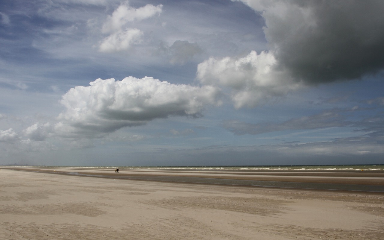
I live a short walk’s distance away from the North Sea beach, and I’m getting visions of sea water running over dry sand. Where the water goes, the sand darkens in colour, as the water layer around the sand particles reflects light deeper into the sand layer, and so reflects less light up towards our eyes. This is the quality of shadow that Summer contour would need. There is no direct shadow cast onto the sand, there is shading happening within the sand.
How does this translate to product? As mentioned before, very sheer! It’s the exact shade of your foundation, with muted taupe mixed in. The colour is still a version of beige, but it contains more grey. I have found some lucky eyeshadow (obviously without sheen, shine, sparkle or glitter) that do the trick rather well.
Winter
Where Summer creates shadow by holding onto light a little longer, Winter has no softness or layering ability. Light doesn’t melt in to skin, the way it would in Summers. Winter’s light is hard and flat. How will we flatter and define the angles of the face in this type of light? A snowscape might have even light but it’s not featureless – it has peaks and valleys. We can still do shade, as light gets trapped and solidifies. Winter shadows are cool and dark.
That translates as a contour with a larger amount of grey, like a greyed taupe. More grey than you might expect. A comfortable, cool-looking contour in the pan might still become muddy once it blends with your skin. So once again, there’s very little chance of finding the right colour packaged as a contour. With eyeshadow you’ll have better luck, using a taupe intended for neutral shading. A natural shadow colour for a face can be applied anywhere, to contour eyes and well as cheeks.
The taupe need not be dark relative to your skin tone. Let’s go back to that chart. In the second row, I starred the second shade down as my contour choice. I might even have gone with the first one. Going lower will probably work great for photography or film, but will make less sense for real life makeup.
Shadows are precise in Winter, because in its clean light, both objects and their shadows have defined edges. The blending of the contour is more compact, less leisurely, particularly on the top edge. A dense kabuki brush with a shallow-dome top comes in handy here. It allows you to blend in narrower gradients with greater precision.
Highlighter is not as easy as you’d expect, getting a colour that’s light enough but not too crystalline. For real life makeup for horizontal yang I prefer a more moderate highlight – closer to skin texture and not excessively shiny.
Spring
This is the only instance where I would steer clear of grey-influenced beiges and taupes, and actually apply bronzer as contour. A warm beige or gentle copper brown belongs with the palette.
Contour usually means matte. However, if one Season will makes sense of shine in shadow, it will be Spring. Keep the effect subtle to avoid an oily or unnatural effect or play it safe with matte products when bronzer is applied in natural shadows as contour.
A shiny or sheen-y contoured bronzer will probably look great in the golden hour on a terrace at the Cote d’Azur, to a background of terra cotta tiles and with pink prosecco on the table. A brightly lit environment will give a reflected highlight on the underside of the cheek, a warm underglow consisting of the surrounding colours. A product that mimics that underglow might look a little less convincing on a rainy day in January in the Netherlands. Context matters. I’m going with shine-free where I live.
Highlighter for Spring is fairly easy, light and golden, and can afford some actual shine for once. Apply it in a wide gradient, so the highlight can spread itself softly across the high point of the cheek.
Contour for yin
The focus of this post is contour and dimensionality for horizontal yang. Just like on our previous post of foundation for vertical yang, that doesn’t mean that horizontal yang has to wear contour. It’s simply that out of the major Align dimensions, it is most enhanced by it. And similarly, it doesn’t mean that contour is exclusive for horizontal yang, and the other types can’t wear contour at all. They can. It would just have more supportive role.
Hang on, contour for yin? How does that work? Contour for yin might sound counter-intuitive, because there is no angularity in this face.
I once thought that contour was exclusively yang, as well as warm-Seasoned. As I keep learning, I find that makeup, style and design have endless options, and everyone can adapt almost everything while staying true.
This is why learning the design principles of your body type is so useful. These allow you to not just replicate recommendations literally, but develop your own eye and cherry-pick your way through retail. You’ll become a composer of many songs, rather than a singer of only one.
That said, emphasising a yin face with yang contouring techniques would not be expected to work in the traditional way. To find out how yin contour works, let’s go back to the function of contour. It’s to mimic shadow. Why did we want to mimic shadow? To emphasise bone structure.
Yin faces also have bone structure. It just behaves differently than yang. The bone points are more circular, rather than straight lines.
How to emphasise that? By placing smaller shadows in circular shapes. Whereas yang contour is a stripe, yin contour is practically a dot or circle, at most an oval. Of course, you’d blend out to avoid any edges, but colour placement is circular and small. Definitely use a smaller brush in smaller areas. I find rounded fluffy brushes ideal.
Dot contouring was an absolute revelation to me. I discovered this technique after I had finally found a product (eyeshadow) that should conceivably work as contour for Bright Winter – and it still looked like mud on my face. The problem wasn’t the colour, so what could it be? I knew contour was a yang-centric technique, and that my face is fully yin. That made it click – I needed to alter the shape rather than the colour of the contour. And it worked!
Anybody with a yin body type who would like to try dot contouring, I recommend to dot your product under the most prominent part of the cheekbone, directly to the sides of your chin on your jawline, on the side of your nose directly above the nostril, and at the outer-upper part of your eye crease. You’ll be amazed.
What did you think of this post? Tell me in the comments! What did you learn, did you try anything new for yourself and what were the results? I am here to answer questions. Next time, we will step into a different kind of dimension: the curves of vertical yin. See you then!
This Makeup Masterclass is a sneak preview to Align style analysis, only for readers of Chrysalis Colour. Align clients get this information on makeup too, plus a workbook for building their signature makeup. Stay tuned to the next posts, as we’ll open doors to Align soon.
Note: the website adventures continue – my website still isn’t up so the buttons below don’t work, but you can always reach me via florentina@callastudio.nl.