What is ‘Contrast Level’?

by Terry Wildfong (California/Michigan)

We often hear analysts and clients say that people are low, medium, or high contrast in explaining how to wear their clothing colors.

But what does that really mean?

Value

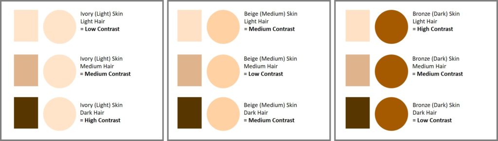
What I learned it to mean in the ’90’s, and how I still use the terms today, contrast levels are determined by one dimension of color: Value (which is light to dark).

Simply, contrast level is the amount of value difference between hair color and skin color.

That’s it.

Nothing more.

But what does it look like?

For ease of explanation, let’s break the skin and hair colors into three categories: light – medium – dark.


Skin Color (as categorized by cosmetics)

  • Ivory (light)
  • Beige (medium)
  • Bronze (dark)

Hair Color

  • Light (blonde, light red, white, gray)
  • Medium (dark blonde to medium brown, medium red)
  • Dark (brunette to black)

Shown below, I have put hair colors (rectangles) and skin tone colors (circles) together according to values.

:

So how does this apply to Personal Color Analysis?

Low, Medium, and High contrasts exist in every season. 

In general:

Low Contrast

In wearing clothing, this group of people would not wear large value differences in their outfit, such as their white with their darkest navy in big blocks.

These two colors in smaller prints or designs would be better because the colors are diffused and appear smaller because of pattern.

Better would be a white with a light value color.

Medium Contrast

This group could wear a slightly larger value difference, wearing their white with medium value colors for contrast.

For most of these people, wearing their white with black/navy can still be too strong and white with a light value color may be too weak.

High Contrast

Wearing their white with a dark value color will work well.

Those with high contrast will not look balanced with dark on dark or light on light colors for the most part.

*We are all unique within our season and contrast level, so small adjustments to the recommendations above are completely appropriate.

Terry Wildfong divides her time between California and Michigan. In addition to in-person Color Analysis, Terry is also an instructor for the Color Analyst training program. Please click the link buttons below for more information.
Terry Wildfong