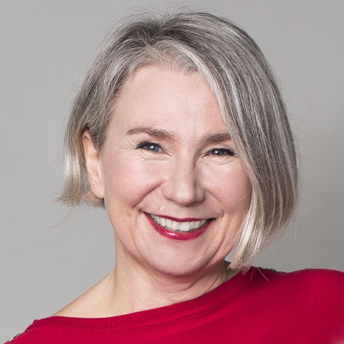
by Jorunn Hernes (Norway)
This is the story of my journey from being an amateur with a strong interest in colour and style, to becoming a certified personal colour analysis consultant. It was a rocky road indeed.
I have always been captivated by the way things are put together, and analyzing and getting to the bottom of things.
I have been a nerd from early childhood, always with my nose in a book, or in other peoples business, asking questions.

My inner nerd grabbed the 80s book “Colour Me Beautiful” with both hands. I borrowed the book at the library and studied it thoroughly. At that time, there were only 4 Seasons, but it wasn’t easy to decide which season I am. According to the book I shouldn’t be a Winter, with my blue eyes and brown hair, but it was definitely in the Winter category
A few years ago I came across an article on internet about 12 tone colour analysis, and after learning that most people aren’t purely warm or completely cool, it sparked new interest in the topic. And with my usual intensity I started exploring the topic once more.
One day I was on youtube watching videos of colour analysis, and came across a video by Christine Scaman in 12 Blueprints. She talked with a quiet authority and explained colour analysis in a way that I felt made perfect sense.
And her book is fantastic. I recommend it highly to anyone with an interest in 12 tone colour analysis. For me it was a revelation. After reading the book I concluded that my colour tone was Dark Winter.
My Colour Analysis Training
After reading all I could come across about colour analysis, I took the big leap and enrolled in 12 Blueprints certification program. March 2014 I traveled to Canada for an intense week with colour analysis from dawn to dusk. I am now a certified 12 Blueprints Personal Colour Analysis Consultant, and have the diploma to prove it.
Part of the training as a Personal Colour Analysis Consultant is that we have to undergo a PCA ourselves. It was a profound experience. I had no reason to rock the boat, I was quite happy in my self-proclaimed Dark Winter colour tone. I was expecting that the analysis would confirm my assumption.
That was not to be. The day of my own analysis came, and after some hours of restless sleep the night before, I had arrived at the conclusion that I would go to the analysis with an open mind, just like we encourage our clients to do. Easy to say to others, difficult to apply to one’s own situation.
To make a long story short, we concluded that Dark Winter was not the winner, there was actually a colour tone that was better than this: Bright Winter. It’s not that Dark Winter looked terrible, it was more like Bright Winter did so much more for me than Dark Winter. And we compared thoroughly, since I was quite firm in my conviction. Me in Dark Winter was a little more subdued and older looking, and with Bright Winter colours next to my skin my face lit up and I looked fresher and younger. I must admit that at that time, all my favourite colours were in the Dark Winter range, but the positive effect that Bright Winter had on me was undeniable. I had to conclude that I had been wrong. I am not a Dark Winter, I am a Bright Winter.
I’m not going to lie. This was not easy for me.
Nobody likes to be wrong. I don’t like to be wrong. And I absolutely hate having been wrong for such a long time. I had a lot to digest.
I studied the photos of myself. I studied my face with a lighter, brighter lipstick. I had to come to terms with having been wrong. I may not be the most avid user of the brightest colours in large portions, but the refreshing effect of the “sunshine on snow” brightness of the Bright Winter palette is growing on me. It has been a process, and I look better than ever.
Nobody can argue against looking younger, fresher and healthier.
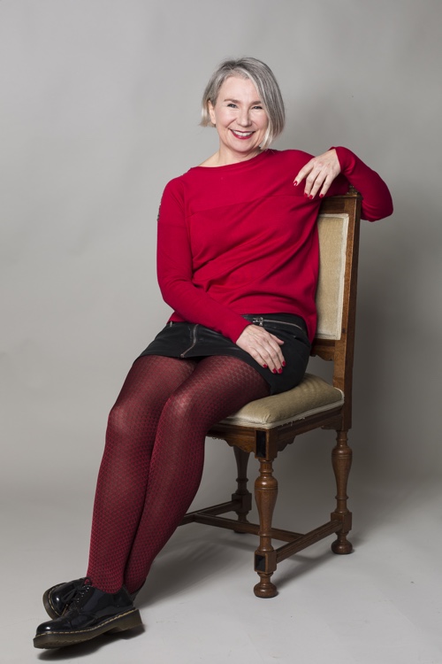 I have also come to the understanding that this is the reality for so many of the clients we see in colour analysis. Almost all of us have set expectations of what looks good on us. And actually, it’s a little difficult to see ourselves. We sometimes see what we have been told and what we want to see.
And it’s not easy to accept that we look better in colours that have not been on our radar, or colours that we have been a little afraid of, for various reasons.
I choose to believe that my personal experience will make me a better colour analysis consultant. I understand how difficult it can be. I understand that it takes time to digest all this new information. I want to be there for you until you have worked through it completely, and give you tools to refresh your knowledge and skills to make the most of your colour tone.
It can be scary to enter the gate to a new colour reality, but I will hold the gate open for you until you go through it, entering reality as an even better version of yourself.
Fun trivia: Did you know that the name of my business, Fargeporten, means “The Gate to Colour”?
