Clothing vs. Cosmetics

While lipsticks and blush relate to an individual’s undertone, foundation is matched to overtone as it is dealing with the outer layer of skin.

I have had many Winters who have a lot of yellow in their skin. They are cool (or cool neutral) but need a yellow (warmer) beige foundation. Don’t be fooled by the color name on the package. Cool and Warm Beige may really be neutrals. I recommend that you do not pick foundations based on names – rather, test them on your skin.

At the end of a PCA session, and once a seasonal result is reached, I offer my clients the opportunity to bring some cosmetics to review together to determine which colors they already have that are in their season, which ones are okay, and which ones to stay away from.

When we shop, we use the color fan for guidance. If the colors are not on the fan, or don’t seem to harmonize, those purchases seldom occur. 

But what if there is a difference in how we should consider colors for clothing vs. cosmetic color choices?

There is. Here’s why.

The clothing and accessory choices we make are worn “as is,” meaning nothing about the item’s color changes once it is on our bodies. What we see is what we get so to speak.

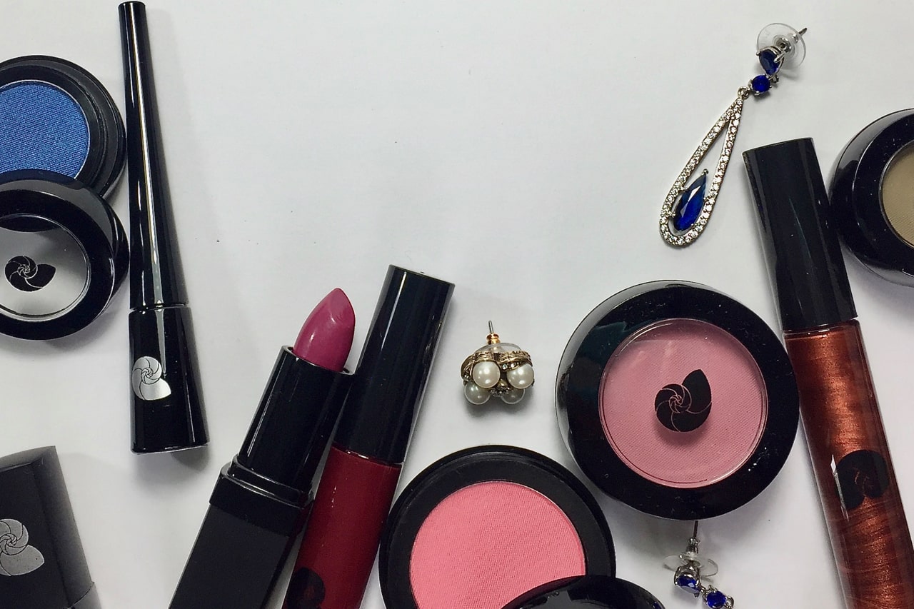
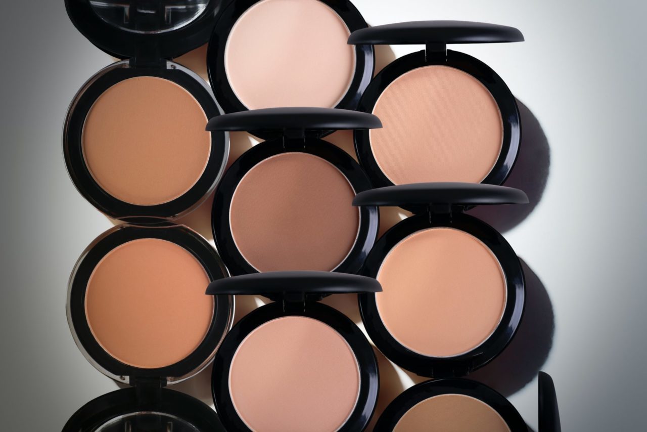
However, that’s not the case for cosmetics, especially for eyeshadow and blush, and lipstick to a lesser extent. The difference? Applying cosmetics requires eyeshadow and blush to be “blended into” the skin, thus altering the color. Lipstick color isn’t blended in but is altered by the client’s natural lip color.

Two women of the same season can wear the same lip color and the color may look different based on their unique coloring within the season. But if we put the same red drape on two people of the same season, the red still looks red.

I need to know three things to help me determine what cosmetic colors will work for a client’s season:

Is the color specific for that season?

Can the color be easily placed (harmonized) into more than one season?

Is the color Warm, Cool, or Neutral?

While it is ideal to “match” or “harmonize” cosmetics with the fan, it’s nice to know we have a broader range of colors we can include that don’t seem to be a match but may work very well.

Terry Wildfong divides her time between California and Michigan. In addition to in-person Color Analysis, Terry is also an instructor for the Color Analyst training program. Please click the link buttons below for more information.
Terry Wildfong