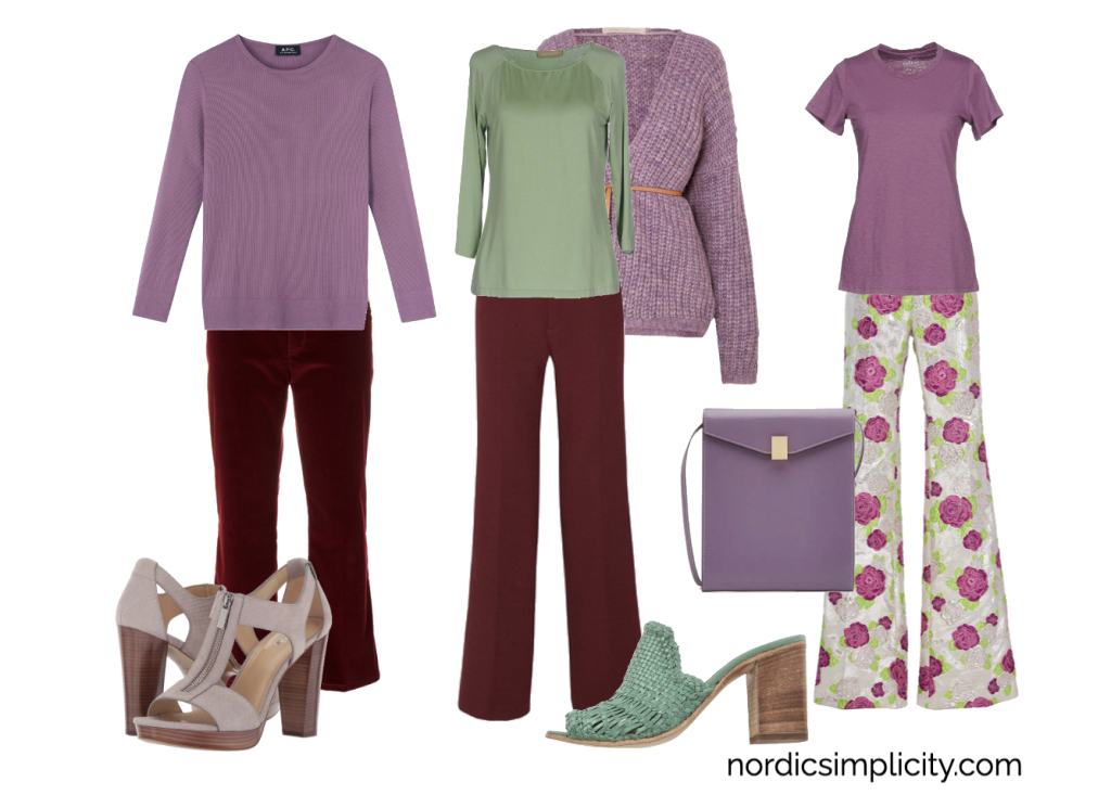
I started with the fun pants in green and mauve. Such a delightful pattern, and it gives all kinds of opportunities to play with colours from the SSu palette. To support this, I picked a couple of dark burgundy pants. If you are of a minimalist mindset, you could easily have enough with one of these. Moving on to tops, two tops in antique rose, short and long sleeve, and a dusty sage green top. Combining these with a soft and comfy cardigan from the same mauve colour family, you can mix and match and layer these items in a myriad of ways, and to complete the look, adding a lavender bag and green shoes would not go amiss, along with a staple pair of neutral sandals.
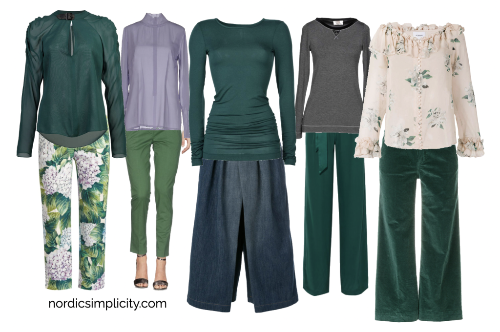
Moving to another segment of the SSu palette, let’s pick outfits from the calming greens, with the merest hint of lavender. Again, starting with a pair of pants in green and floral, we can build a wardrobe of lush greens that there are so many of in the SSu palette, and insert a little greyed lavender for interest.
Look how many green pants I found! I paired the pants with a cream and green blouse and many green tops and added a light lavender top picking up the hyacinth flowers of the pants. I think it supports the green without reading as overly blue in this context.
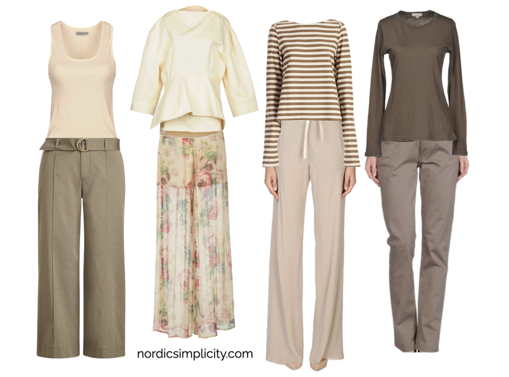
Such a glorious range of neutrals, from pale straw to pinkish beige and greige to deep taupe.
And since I’m obsessed with floral patterned pants, I couldn’t resist sneaking one in there. Granted, it has pinks and greens, but the overall impression is one of delicate cream of caramel light beige. Add three more pants in beige and taupe, and you have the backbone of a very elegant capsule wardrobe using mainly neutrals. The tops are kept in neutrals, combining pale straw and dark taupe for the striped top, and the very delicate yellowish white for the blouse, a tank top in solid beige and a sark long sleeved deep pinkish brown top. All these can be combined all around and makes for a super capsule wardrobe for traveling. Pair the outfits with sandals or shoes and scarves and necklaces, add a smart jacket and you’re good to go anywhere. Put a bathing suit in your suitcase with these items, and you can go on a cruise for a week and be well dressed enough for anything from dinner with the captain to promenading on the top deck.