Contrast and How You Can Use It to Your Advantage

Contrast and how to use it
by Jorunn Hernes (Norway)

Exploring how you can make the most of your contrast level in outfits

Each of the 12 Seasons has their own inherent contrast level. Knowing the contrast level of your Season and using it when planning outfits in addition to picking colours from your colour palette, helps express your Season’s essence. you.

I find revealing the secret of the season’s contrast one of the things that most of my clients haven’t thought about. They come to the colour analysis expecting knowledge mostly about whether they are warm or cool. Some have some awareness of chroma being part of the Season’s essence, but many of my clients have not thought about the importance of contrast and are delighted to discover what a magic tool this is!

Knowing and using your contrast level can sometimes help you tweak colours that aren’t ideal for your Season into a passably correct outfit, colourwise.

Wait, what? Am I giving you permission to cheat?

Never.

But yes. I am giving you permission to cheat. A little bit. Because this is real life. And in real life, we do not always have the budget (or access to the right clothing shops) to build the perfect wardrobe for our Season. And using your contrast level as your secret weapon helps!

Let me show you ways to use your contrast level to your benefit.

There are two kinds of contrast

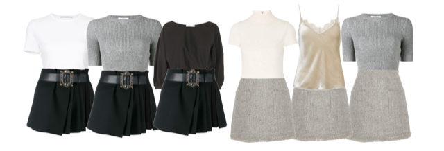
Value contrast is contrast between light and dark. Value contrast can be expressed in darker or lighter colours:

high, medium and low value contrast

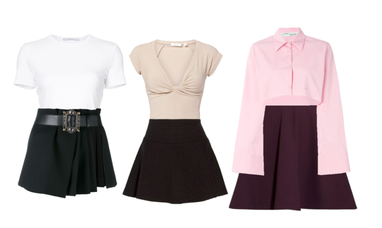
Bright sparkling white with midnight black, or cappuccino froth beige with deep espresso brown, or icy light pink with deep aubergine are examples of very high value contrast:

value contrast

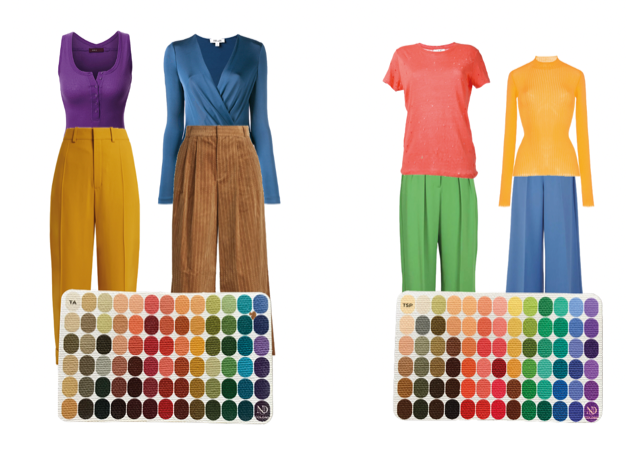
Colour contrast is the contrast between different colours. Complimentary colours make the most energetic colour contrast. Purple and yellow, blue and orange, red and green, and more subtly: teal and ochre, lilac and butter yellow, blue and brown.

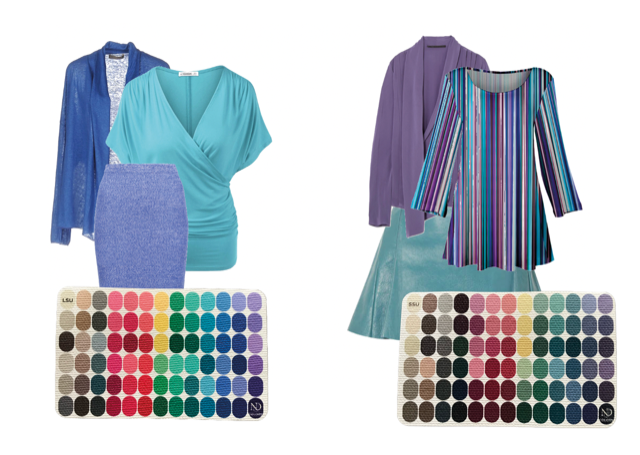
Analogous combinations like blue, turquoise and green or blue, indigo and purple represent a more subtle colour contrast.

Analogous contrast

High contrast

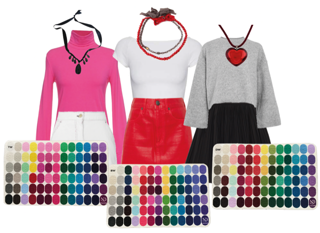
Seasons with high value contrast are the Winter Seasons plus the Autumn Seasons that are under the Winter influence, Dark Autumn and Bright Spring. The winter Seasons use value contrast to bring the crisp, sharp essence into outfits. As far as colour contrast goes, using one colour with a neutral is an effective way to use colour contrast for Winters.

Below the examples are from Winter palettes: Bright, True and Dark

High contrast

Medium contrast

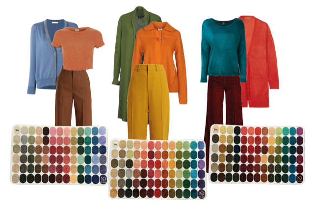
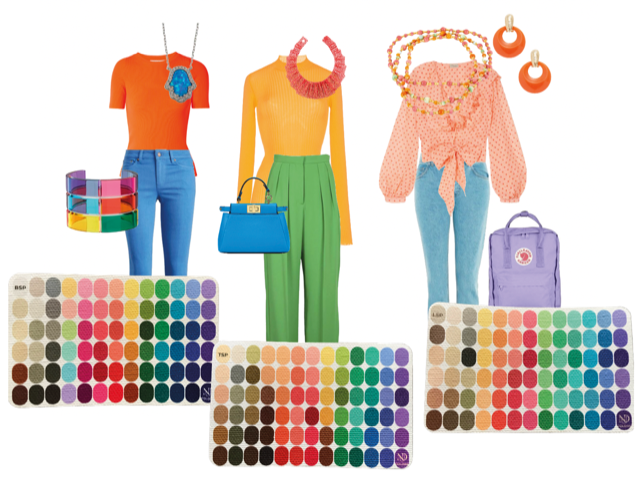
Autumn and Spring have medium contrast in value (dark to light) but benefit from high contrast in colour.

Examples from the Autumn palettes: Soft, True and Dark.

And Spring: Bright, True and Light.

Colour contrast in Spring palettes

Low contrast

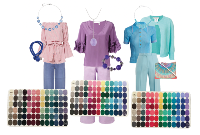
The three Summer Seasons look great in low value contrast and medium colour contrast. Summers thrive on monochrome colour combos of medium contrast, and analogous colours are divine, offering subtle colour energy without sacrificing the calm elegance of being a Summer. The exception being Light Summers, who have enough Spring energy to benefit from a medium contrast level, to showcase the sunny Spring influence.

Summer examples: Soft, True and Light.

A game

“But cheating, Jorunn!” I hear you say.

“You promised to tell me about cheating!”

OK, let’s play that game.

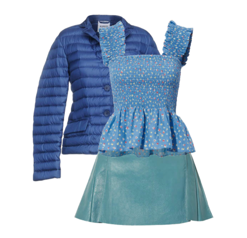
Let’s say you thought you were a Summer, and you have paid lots of $$$ for this stunning and horrendously expensive down coat, a jacket that you absolutely love. You have been wearing it with an equally expensive leather skirt and various dusty soft blue tops.

You go have a personal colour analysis, and you find out that you’re a WINTER! And you need to tweak your wardrobe into more sharp, high intensity colours.

Summer to Winter

What to do?

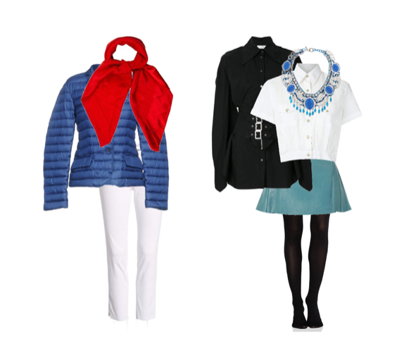
You want to keep the skirt, and you can’t afford a new winter coat. If I were your colour analyst, I would tell you to keep both, especially the jacket (but gently let you know that the peplum top might need to find a new home) but since you adore the skirt we would work with it and see how we could salvage it and make it work in your new Winter wardrobe.

Here’s what I would suggest:

Combine them with accessories and clothes of maximum contrast.

As you can see, you may want to find a different skirt at the first opportunity, but because it’s far away from the face and you are wearing your best colours near the face, it will be better than to keep wearing it with hazy Summer colours.

Keep the clothes and introduce more contrast

The jacket already has a higher intensity blue, so is easier to tweak into Winter territory, by adding bright white and true red.

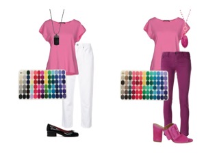
Here is another example of tweaking an item into two different Seasons, that I used in this post on my Nordic Simplicity Substack publication. This post featured a pink top that could be used as a Bright Winter or as a Light Summer, by picking the right contrast level:

The collages in this post were created in Urstyle.

The Season colour palettes shown are from NDU colors.

Would you like your very own Season colour palette? You can order your own Season poster or mini colour card from NDU colors.

If you want a special Nordic Simplicity discount on NDU colours products, click here.

You can also find Jorunn here and here.

Jorunn Hernes is located in Norway, where she offers in-person 12-Season Colour Analysis. Jorunn blogs in English and Norwegian about colour and style, with particular focus on minimalism and practicality. Please click the link buttons below for more information.
Jorunn Hernes

4 thoughts on “Contrast and How You Can Use It to Your Advantage”

    • Anna Lazarska says:

      It depends on how colorful their natural pigmentation is. Those who are closer to Spring can pull off a little more color, but most do better with medium color contrast.

Leave a Reply

Your email address will not be published. Required fields are marked *