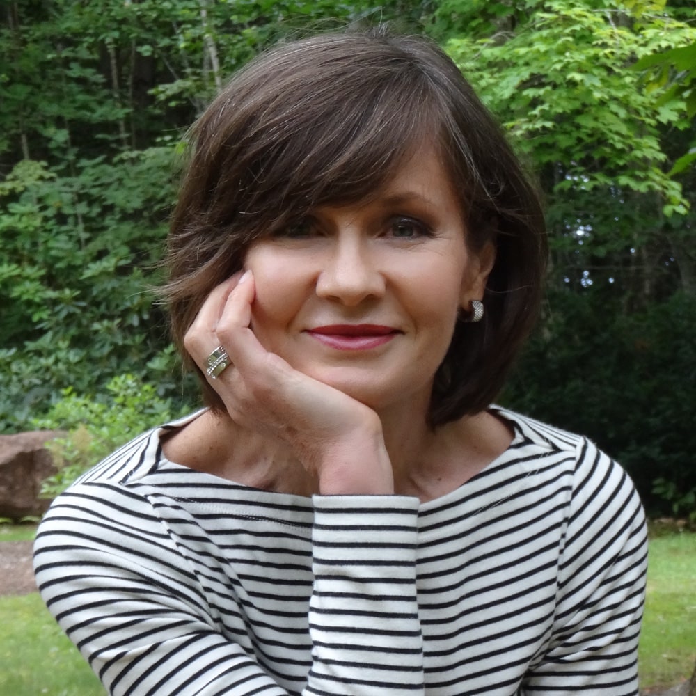
True Autumn:
Wear bronzer, a beautiful extension of the natural qualities of the skin. The product can be applied in a relaxed way since it’s hard to overdo the effect, warm golden light streamlining so perfectly with the colouring. For Autumn’s warm-neutral Seasons (Soft and Dark Autumn), a little restraint may be better, using a lighter application.
Wear jewelry near the face, both in warm golden metals and deeply coloured stones. Any effect that elevates the warm glow is worthwhile. Many of the palette reds are soft orange, coral, and copper, which may create a natural lip, a cosmetic effect that works better for Autumn than any other colouring. Springs look healthier with more colour, Winters with more distance between skin and lip colours, and Summers with pinker and bluer tones.
Autumn bone structure is magnificent. Warm russet tones in blush and lips develop the facial contours, define the features, and create more excitement than cheeks and lips in shades of earth, gold, or browns, matte or metallic, which are believable but leave room to move when vitality and passion are the messages. The flush of blood communicates health and energy in most desirable ways.
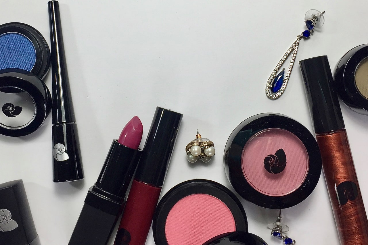
True Autumn is rarely a person of particular darkness. The darkness of each feature tends to keep pace with the other features to create an overall warm glowing look. Fire-coloured highlights need no explanation, and yet fire is not especially dark; it is especially warm. Likewise in makeup, think of the iconic images for the Season, of the October forests in the Northern hemisphere, and replicate the same movement of colours in medium darkness levels using gold, orange, red, green, brown, and gray. As ever, the thinking and legwork have been done for you, with ready-made cosmetic palettes at the 12 BLUEPRINTS store.
Soft Autumn:
Colour is gently earthy, retaining some of Summer’s grace. The delicacy of Summer remains, combined with more support from the warmth of incoming Autumn.
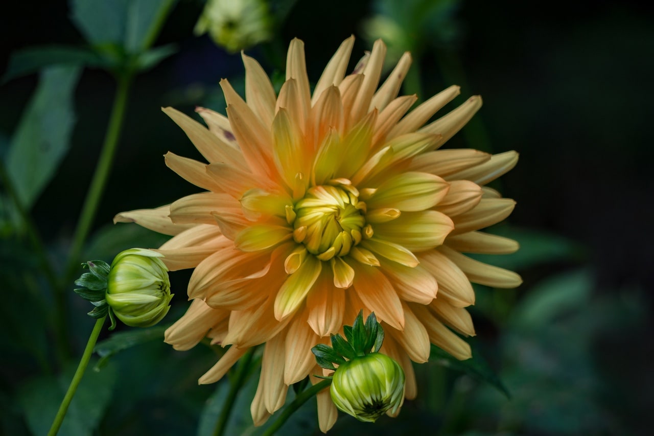
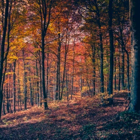
Although the lightest of the 3 Autumns, the importance of darkness applies. Without enough depth of colour, Autumn faces cannot develop the beauty of the facial bone structure. If the flower image at the top were digitally adjusted to lighten the shadows, what would happen to the impact of the image? It would be lost, right? The flower would flatten and appear weak and the background would be wishy-washy. Neither could come alive, glow with colour, or fulfill their roles in the images. Faces are exactly the same. When an Autumn person doesn’t glow in their colours, something real has been lost. The action step is to simply wear soft, warm colour that is dark enough to slide into the Soft Autumn palette without anyone noticing.
Bronzer is the lightest of the Autumns, in a colour reminiscent of peanut butter or medium-dark butterscotch.
Has it been your shopping experience that eyeliners that you thought would work often apply too dark and/or too hot (orange or red)? This happened to me over and over until I finally found one. The Essence line is at Shoppers Drug Mart in Canada, and probably many other places. The eyeliner pencil called Teddy costs less than $5.
Using eyeshadow as liner is wonderful on the Soft Seasons to avoid harsh lines, control the darkness or density of application, enhance the low contrast effect further, and offer more choice of colours.
Be sparing with shine. How would shine be used to enhance suede? By invoking Summer’s grace and restraint. In clothing, a stripe of gold woven through a scarf or print can be truly beautiful. In too large an area, the attire begins wearing the person. In cosmetics, a metallic glint in the lips or touch of shimmer in an eyeshadow is plenty.
This is the subtlest of the warm colouring groups and the nature of shine is to become in-your-face or even aggressive, incompatible images. For our cosmetics to tell our beautiful stories, they must follow that which we are. Said differently, for makeup to make sense, play the hand you’ve been dealt. Soft Autumn is a beauty of a Season but like all 12 groups, will refuse to be seen at its best if pushed in an opposite direction from the person wearing it. As The Beatles sang, let it be. Trust that this colouring will speak words of wisdom and kindness like no other.
Dark Autumn:
If Soft Autumn is Indiana Jones, then this is the Marlboro Guy. The picture is bolder, heavier, and thicker to the point of being solid. Soft Autumn’s warm ceramic pink became spiced apple in True Autumn and is now darker and harder, as garnet . Therefore, darker and more defined eyeliner works, either linear or smoked. The colour could be warm dark chocolate or tornado gray, the former being much easier to find in retail.
Bronzer is also darker. In a world of garnet, gingerbread, tornado, and onyx, what could be expected from peanut butter? It might make more sense than candied peach but could it deliver enough effect? No. Burnt caramel may be a better choice for the same investment.
With incoming Winter, drama as contrast meshes perfectly with the face and person. Contrast means separation or distance between two things. Choose an eyeshadow contour or outer eye corner that is substantially darker than both highlight and medium eyeshadow is better, along with more defined brows, and a mouth that separates from the face, together at once to maintain balance in the halves of the face, continuity of face with hair, and even weight between head and attire or body.
Flesh tones in lips work better on Autumn than any other, though in our best makeup, everyone is wearing their flesh tones. For Dark Autumn, colours are more impacting than the True or Soft Autumn flesh tones in the tube. On the face, they define the mouth without standing apart, as all great lipstick does. They are darker, redder, maybe a little burnt looking.
Ideal hair colour for the 3 Autumns is often somewhere among the eye colours, an effect very few other Seasons accomplish so interestingly. Wheat, warm gold, warm brown, cognac, and gingerbread brown in eyes and hair together are compelling.
Hair is the sculpture we wear on your head. Its colour is the hat, the one that’s always seen with eyes and skin, the biggest colour block in the head besides skin (which we register as neutral in health), and the one that will be seen with clothing. Hair is also just another feature and reacts to the colours we add, as do any colours placed next to one another. Therefore, it’s profoundy important in creating appearance. As with appearel, it should not step in front of us in the veiewer’s awareness. We wear our clothes, they don’t wear us. We wear our hair, it shouldn’t wear us. Ditto makeup. If the viewer expends energy to ignore or understand something in our presentation, our appearance is distracting their attention. We have other, better choices.
For Dark Autumn hair, the right colour is often warm medium to dark brown, from chestnut to coffee bean. The most common adjustments are reducing the dark reds in the auburn tones or adding darkness to blonde tones. An auburn or burgundy that is too dark or cool may be severe for the skin, with relief and youth returning once the colour is warmed and softened to a colour more brown than red. Blonde tones may create a washed out effect in the architecture of the facial bones, with warm chocolate or dark copper offering a better look.
Terrific hair colour that’s worth every cent it costs is a work in progress. Begin wherever you are, ask your colour analyst for suggestions at the time of your appointment, keep a photo diary of yourself in the same attire and lighting, and make changes in increments to arrive at a sophisticated and defining colour that smooths and even the skin, as you saw in the mirror with the drapes.